Draakon & Kuu is a small publishing house. They have published books by authors and illustrators from all over the world – stories that open up the colorful and curious world around a child, and the mysterious world within. Stories that make you laugh, touch the heart, spark questions, nurture belief, and inspire dreams.
We believe that good books can change a person – and the world. We believe that a small person who reads will one day grow into someone who can think independently and make wise and thoughtful choices. Someone who cares – about themselves and the world around them.
books
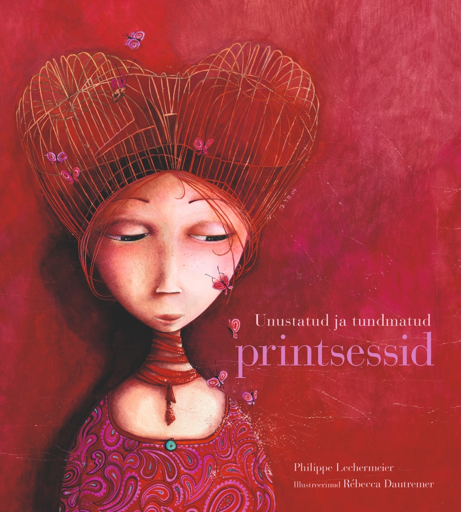
Forgotten and Unknown Princesses
Author: Philippe Lechermeier
Illustrator: Rébecca Dautremer
The layout and localization of this book presented a unique challenge — the entire publication was essentially composed of illustrations, with the text being an integral part of the artwork itself. To preserve the integrity of the original design, great care and effort were required: extensive Photoshop work, creative font matching, and manual craftsmanship were all essential in ensuring the result stayed as true to the original as possible — both visually faithful and aesthetically beautiful.
Are you familiar with Princess Forget-Me-Not? Have you ever met the Ice Princess, encountered the Night Princess in darkness, or exchanged thoughts with the Alphabet Princess Patchwork?
Mysterious and beautiful, eccentric and intelligent — these forgotten and unknown princesses are waiting to be discovered.
A gorgeously illustrated, vibrant picture book by acclaimed French illustrator and Sorcières Award winner Rébecca Dautremer.
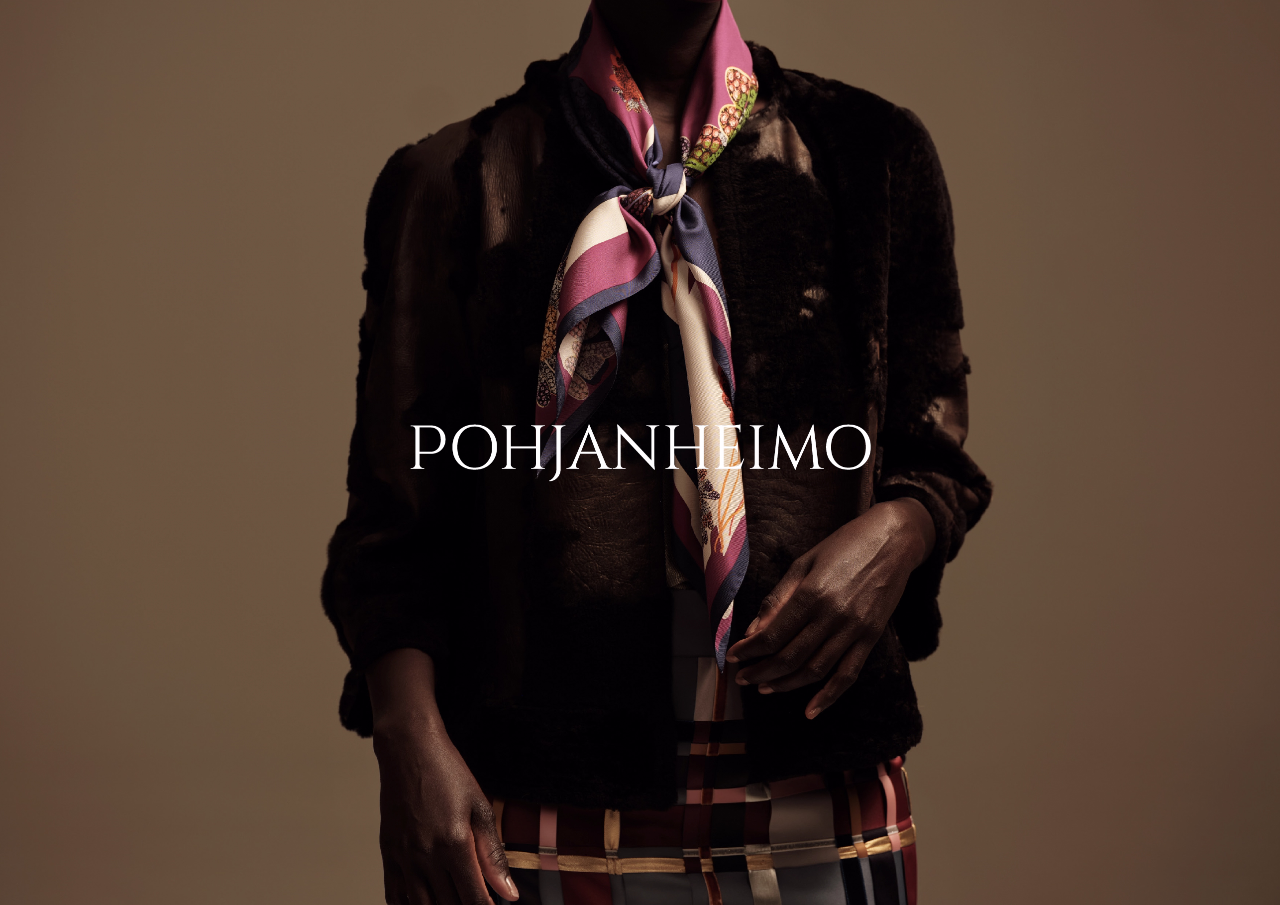
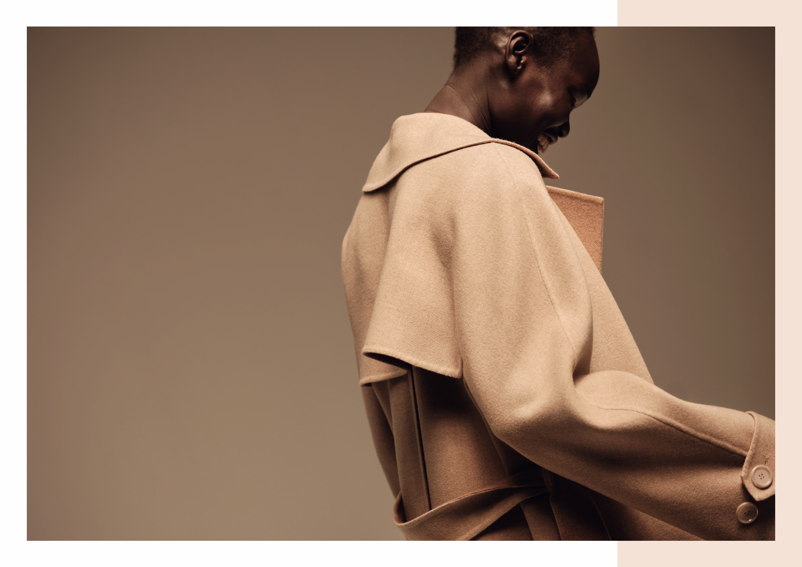
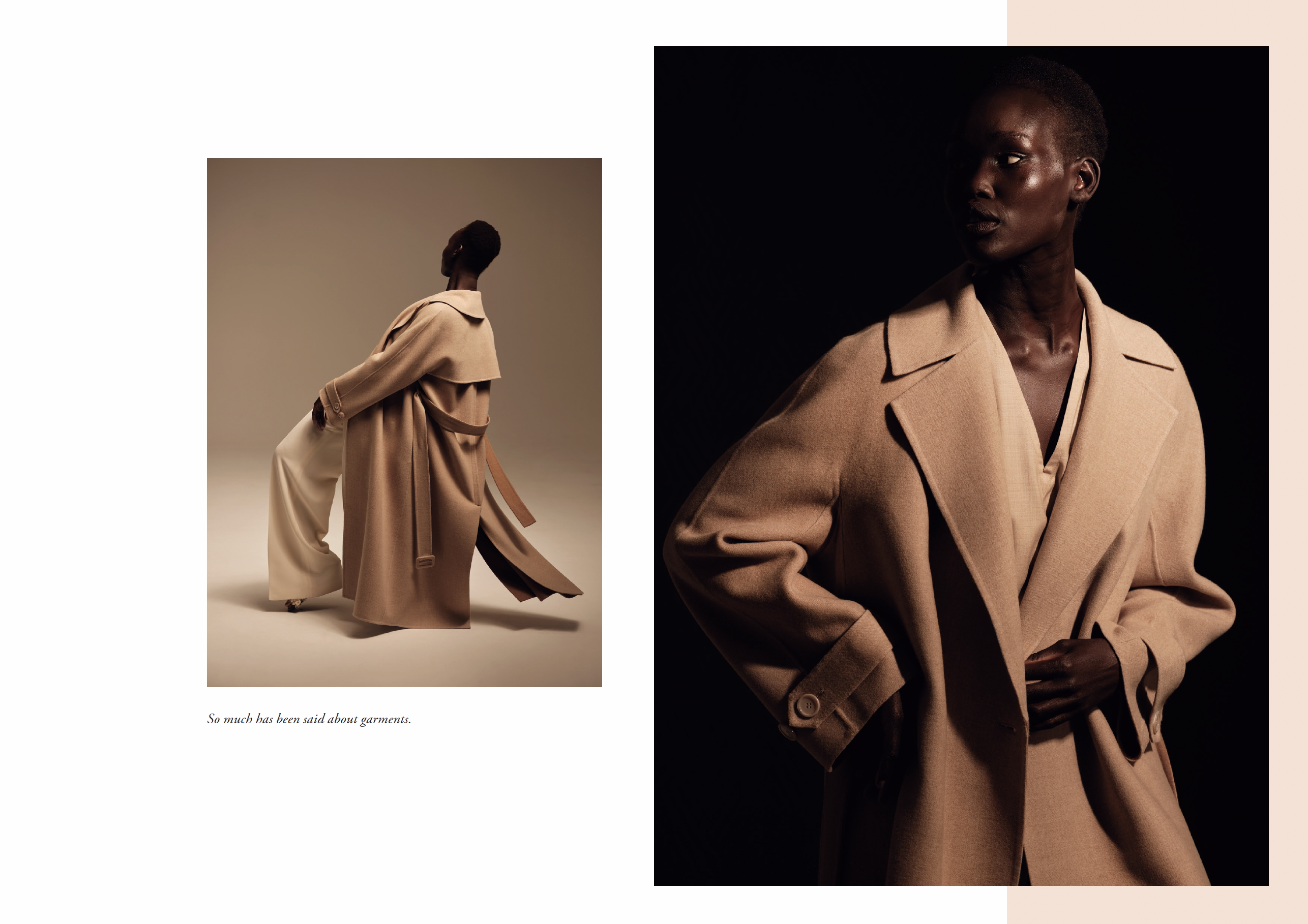
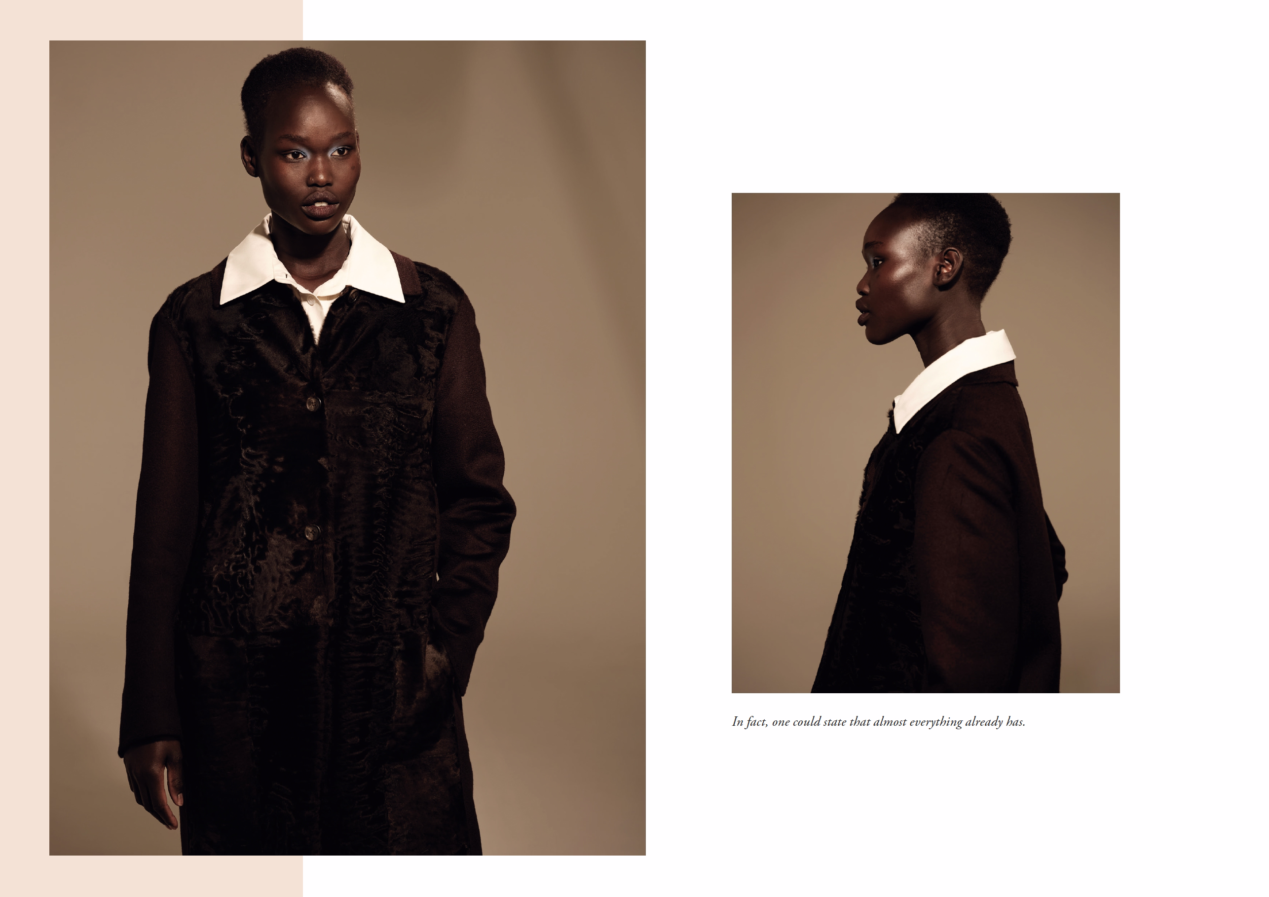
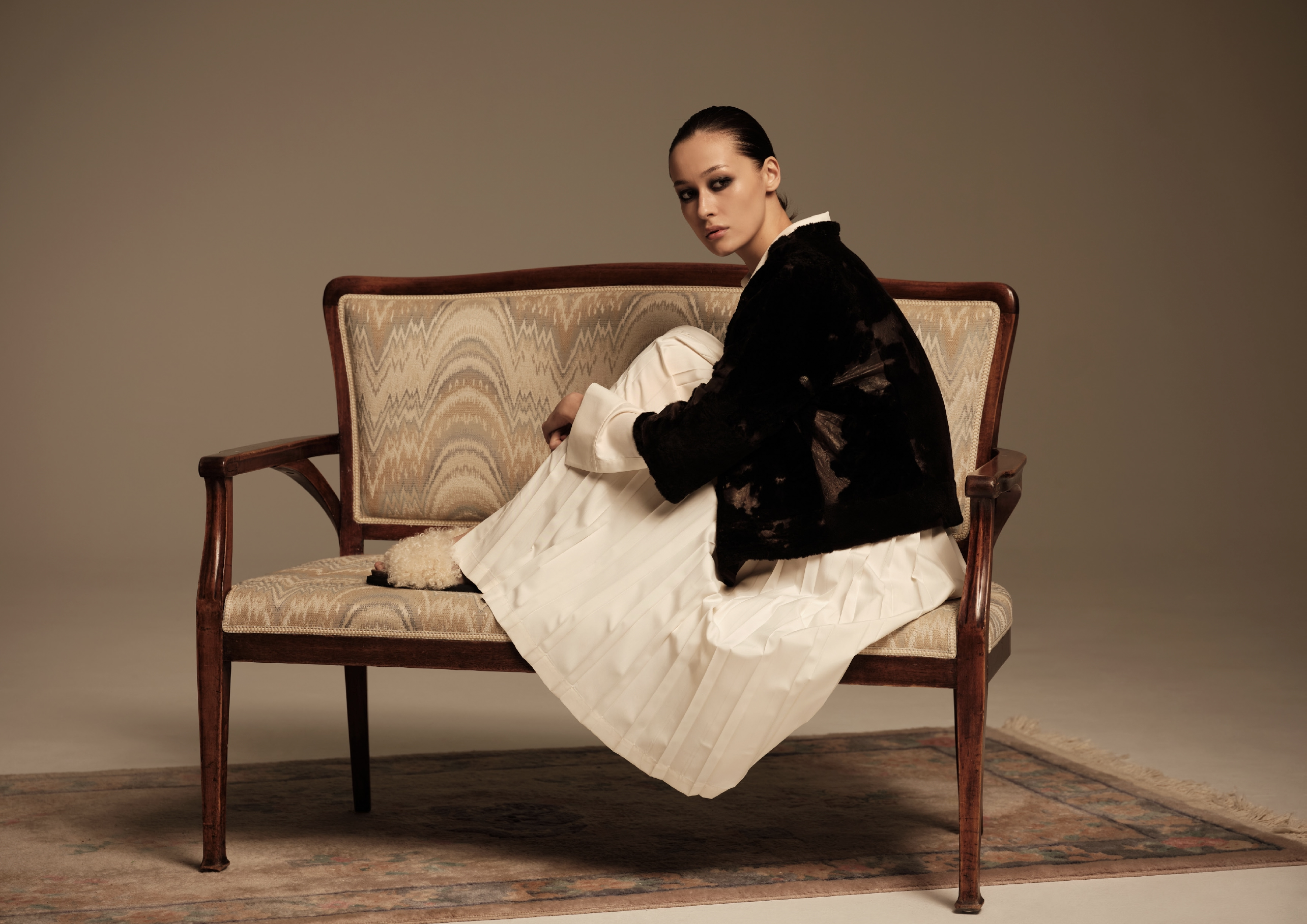
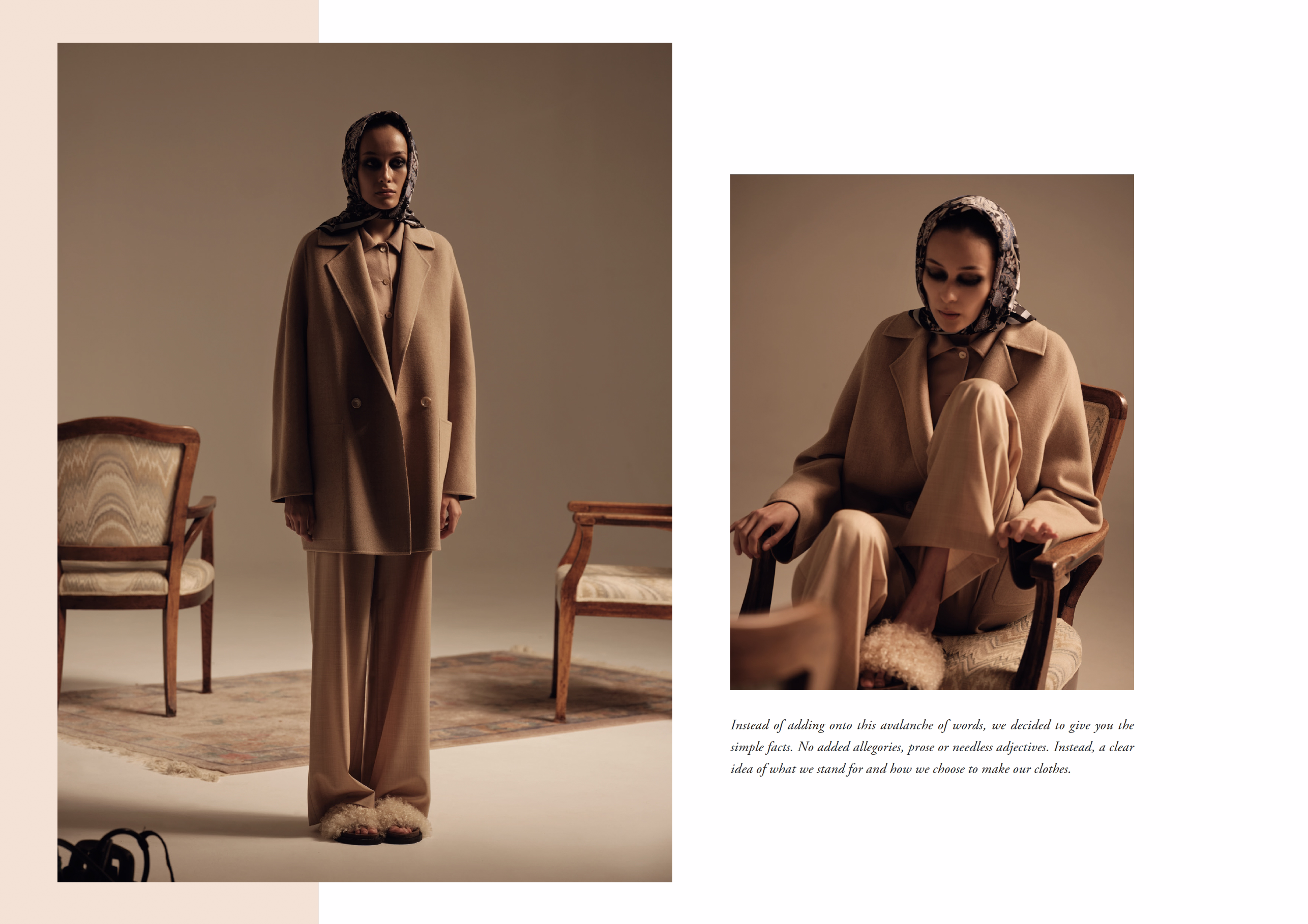
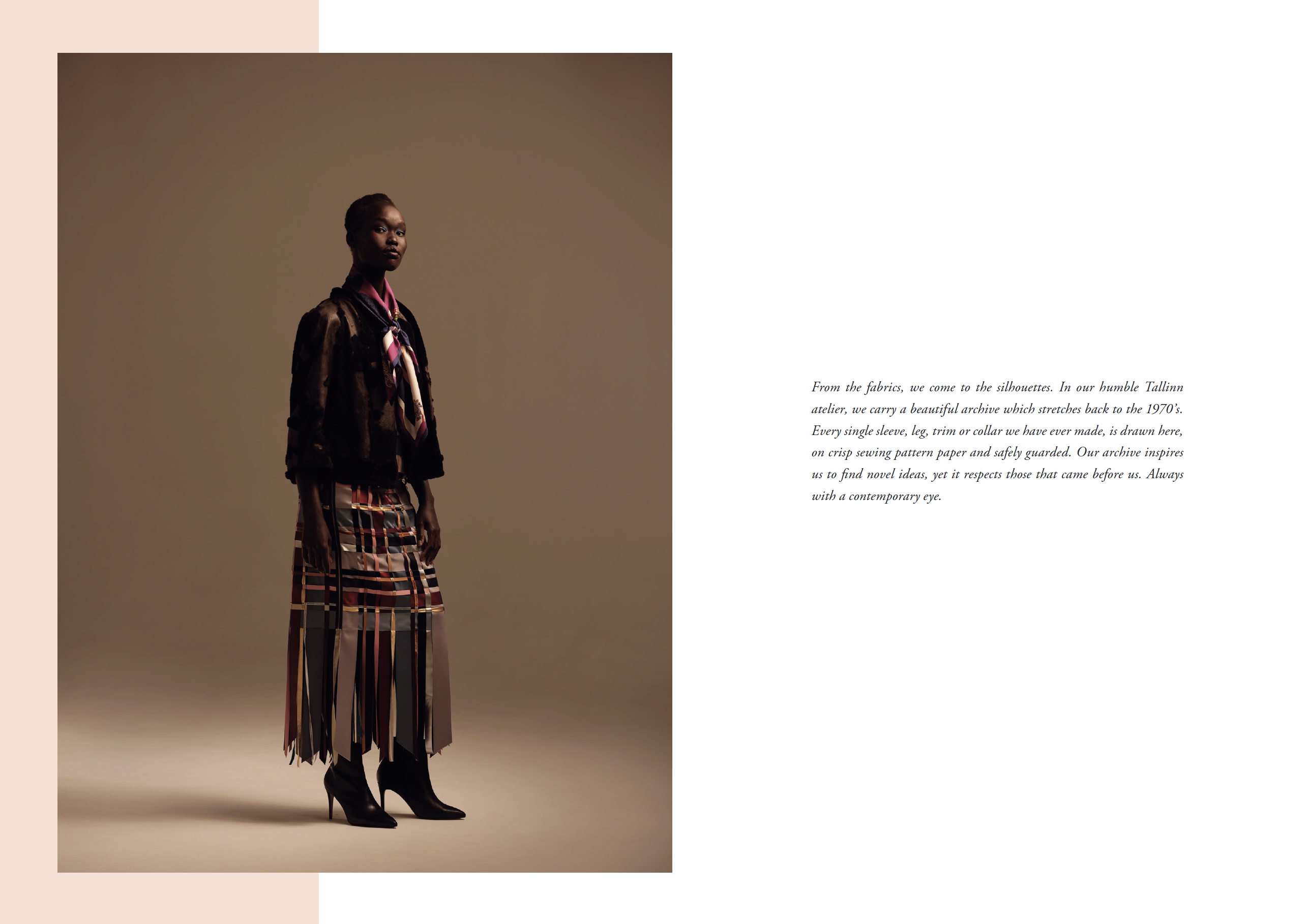
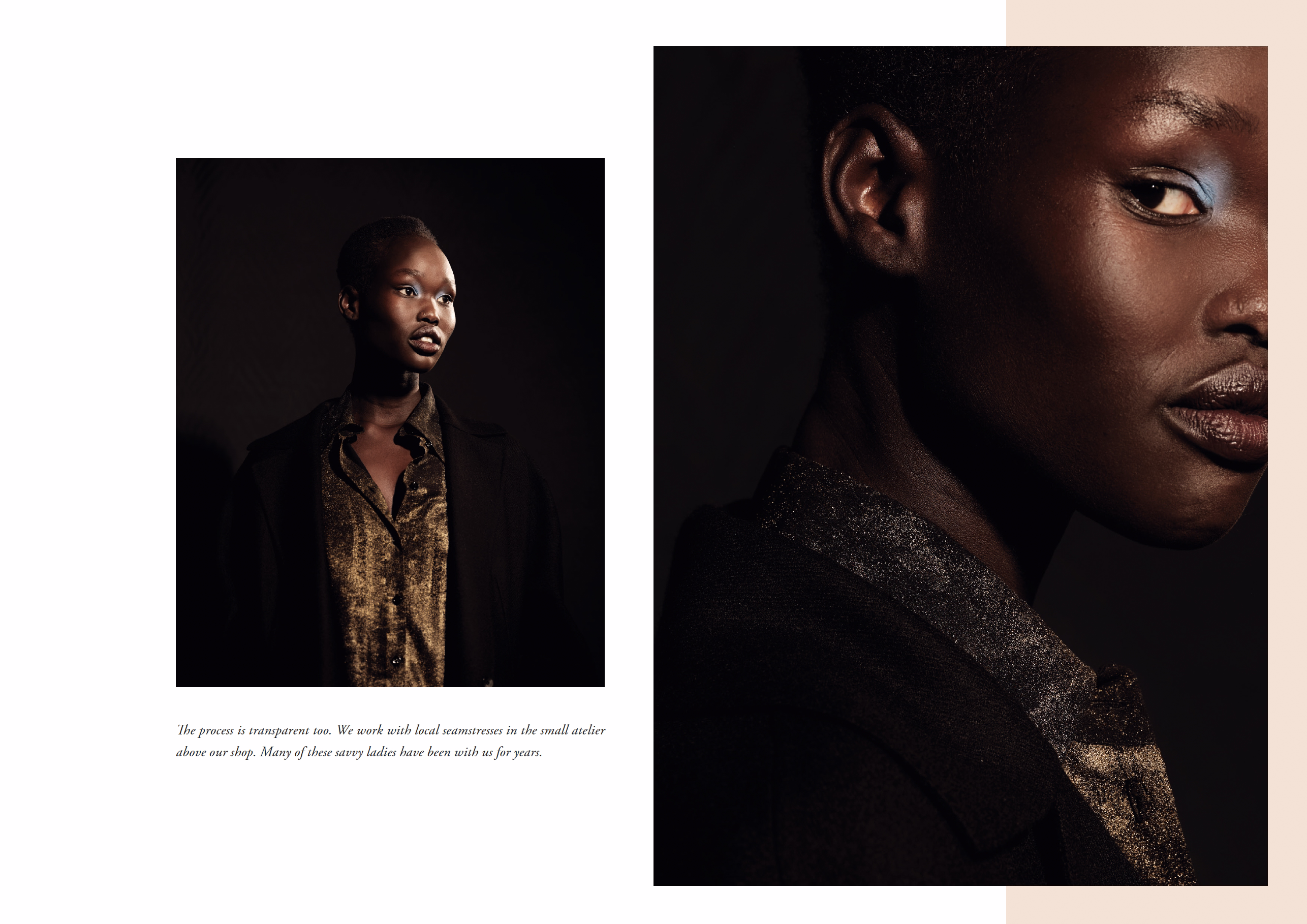
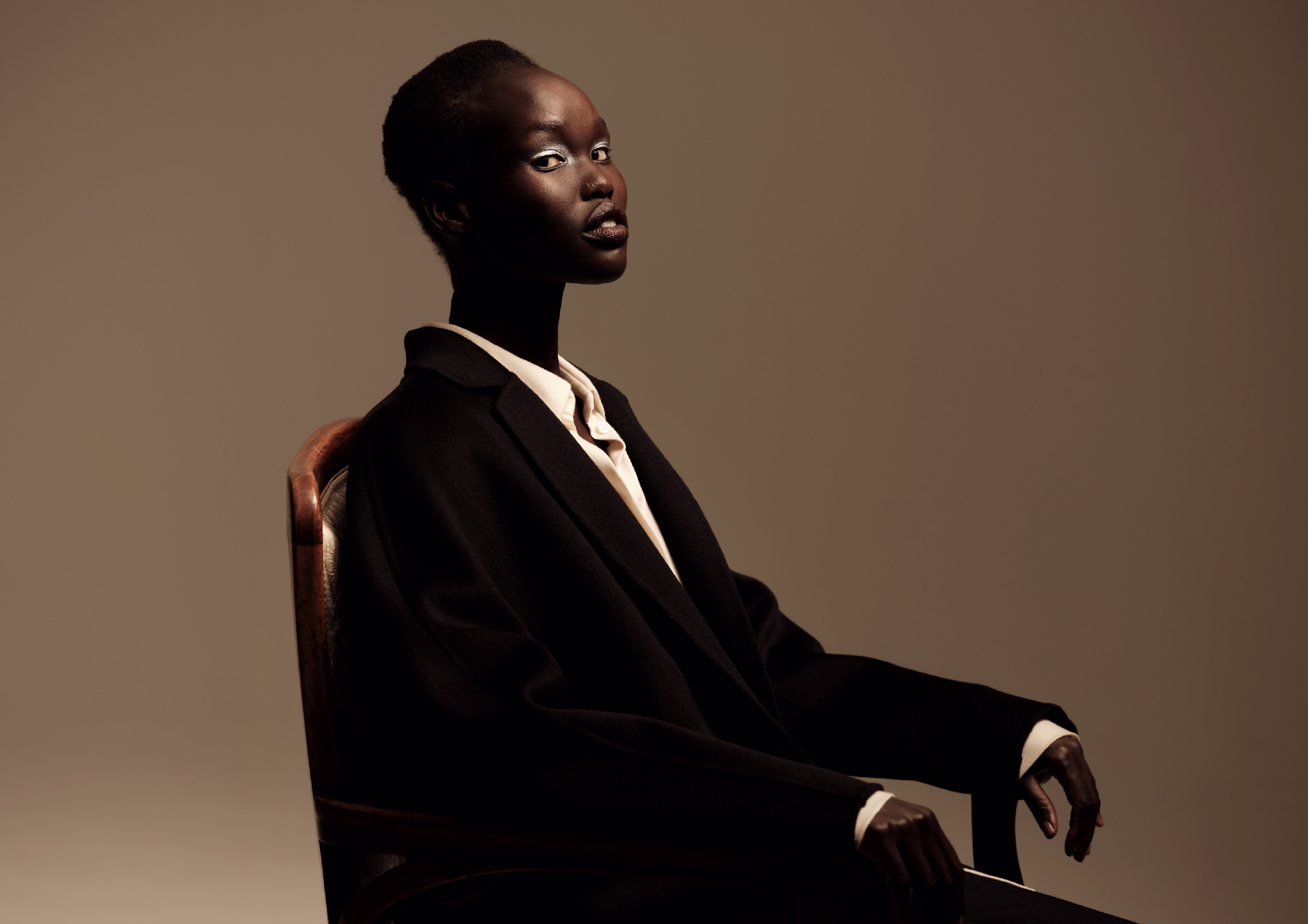
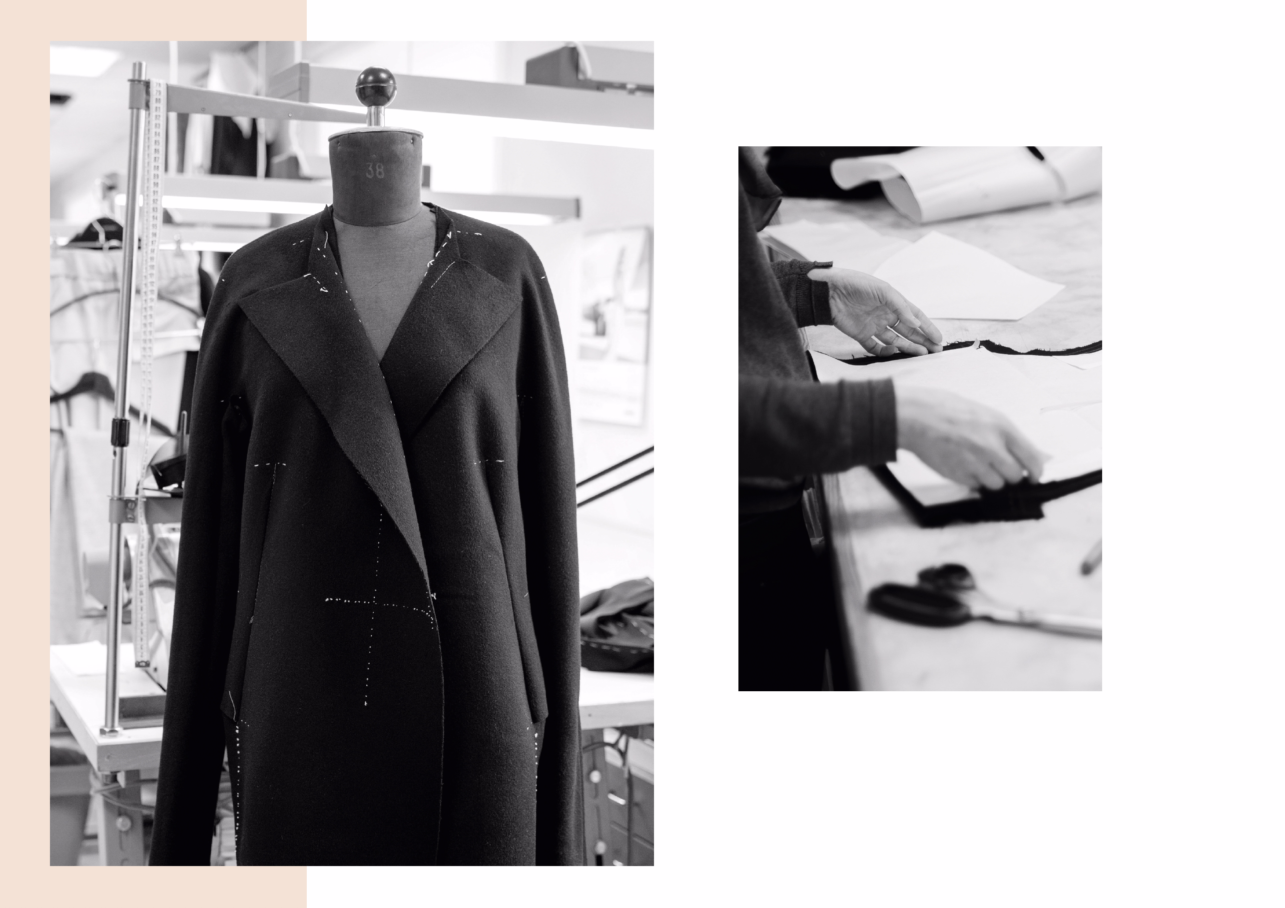
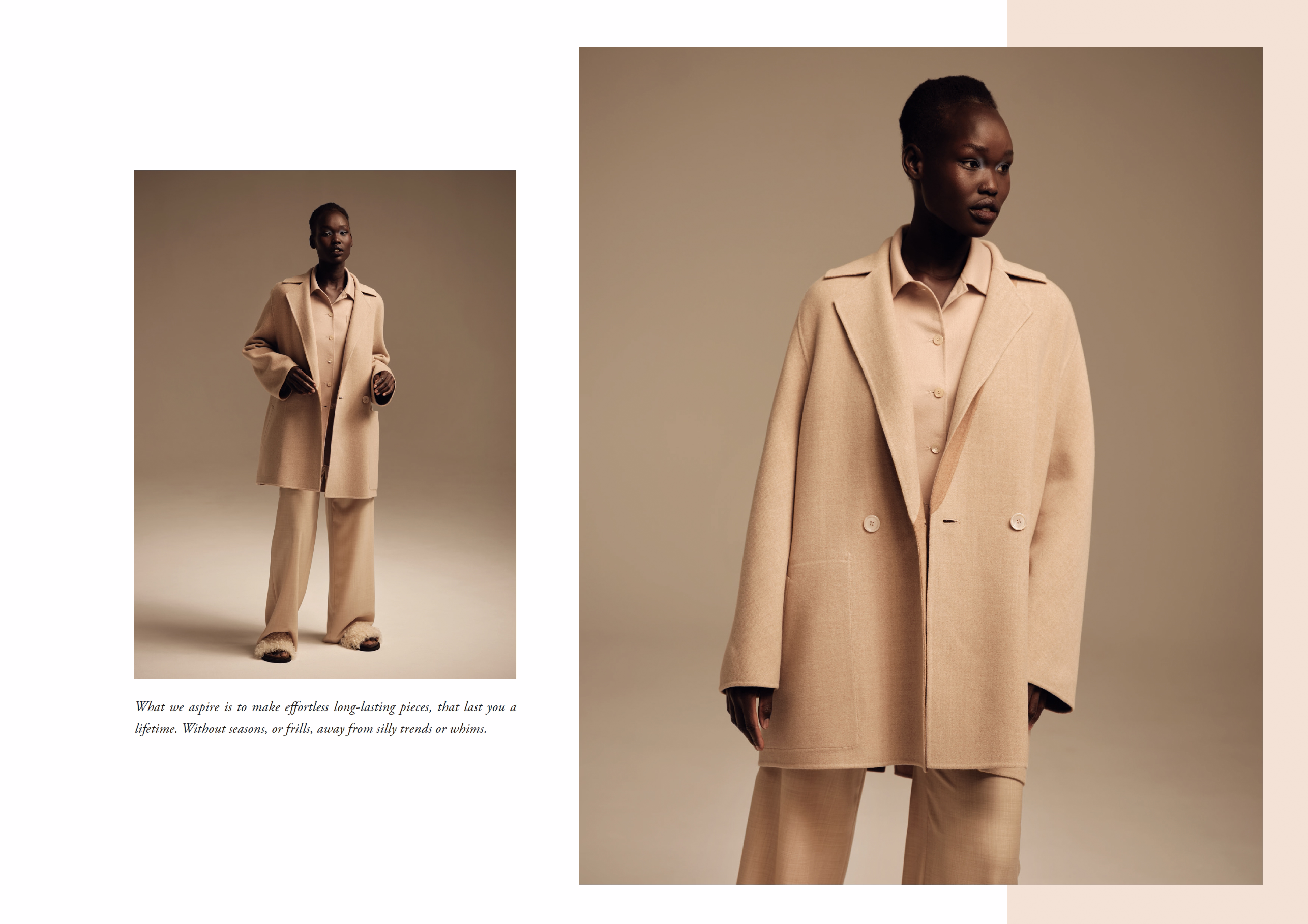
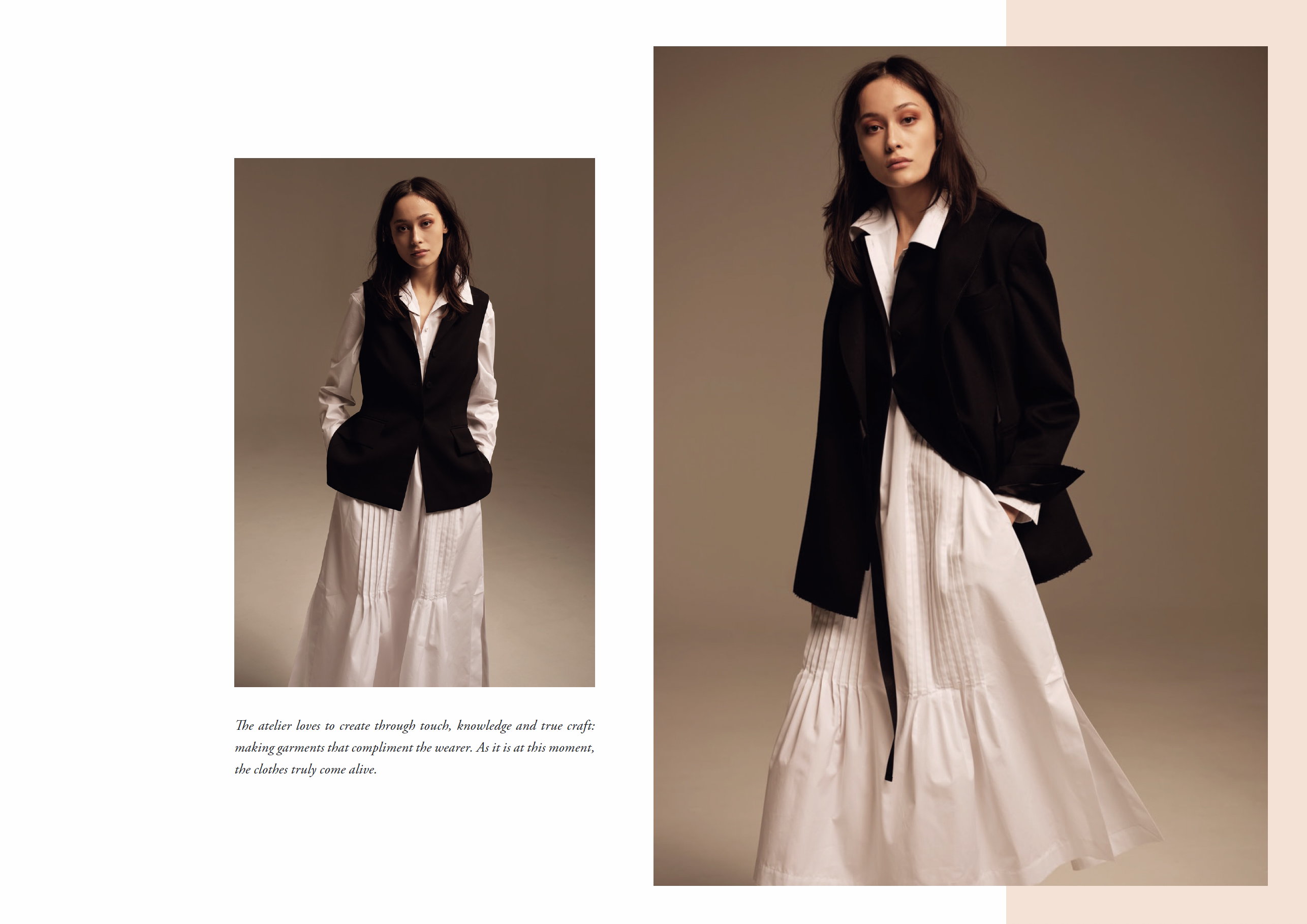
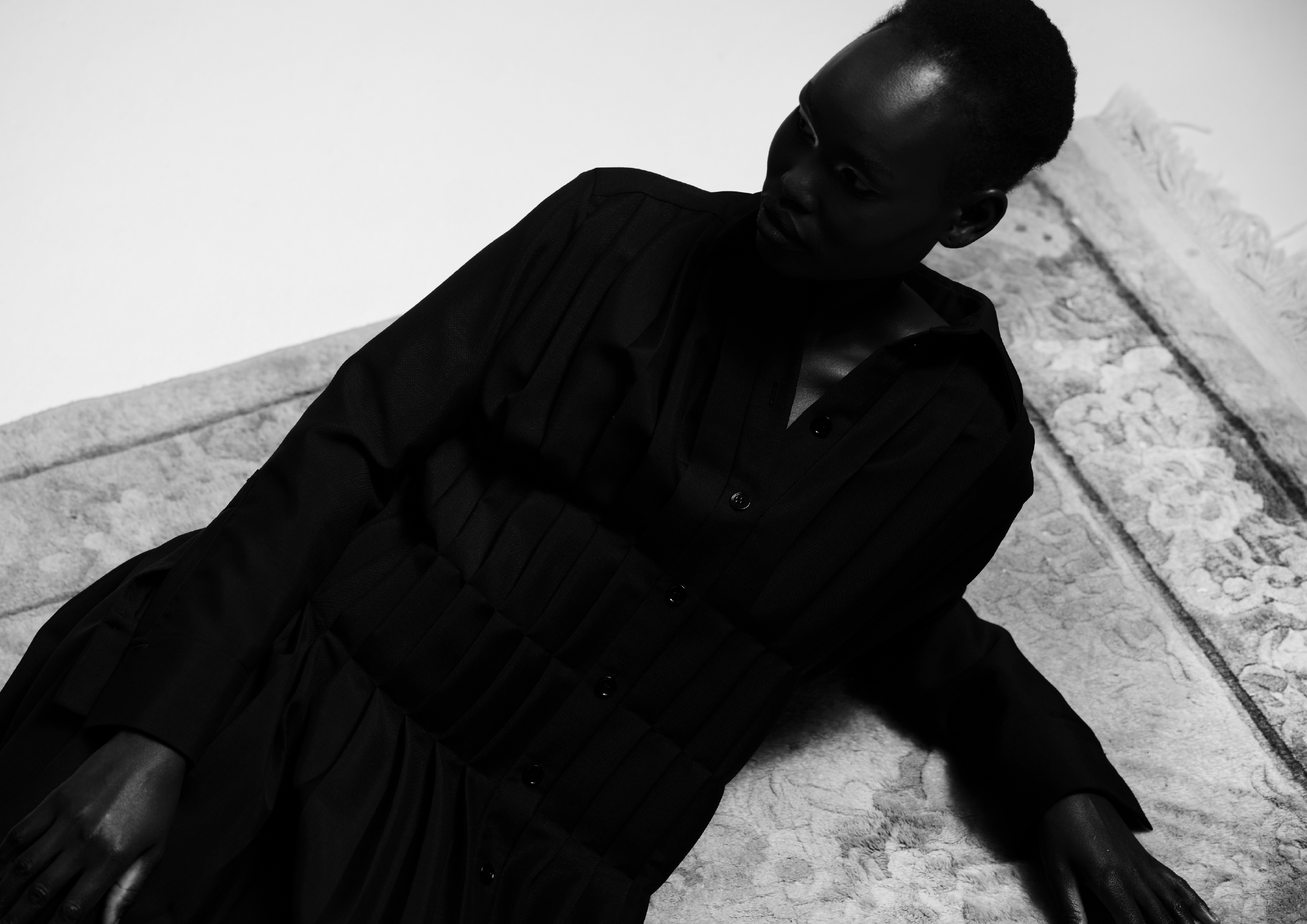
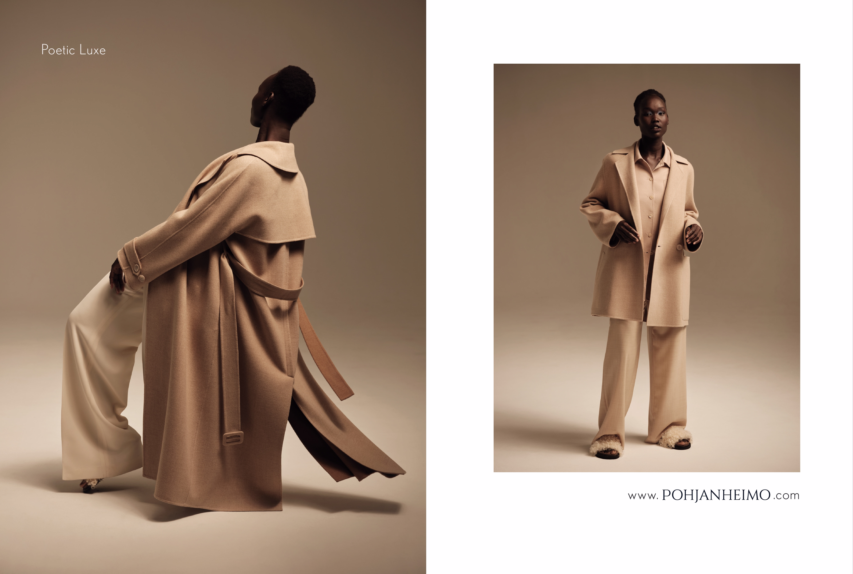
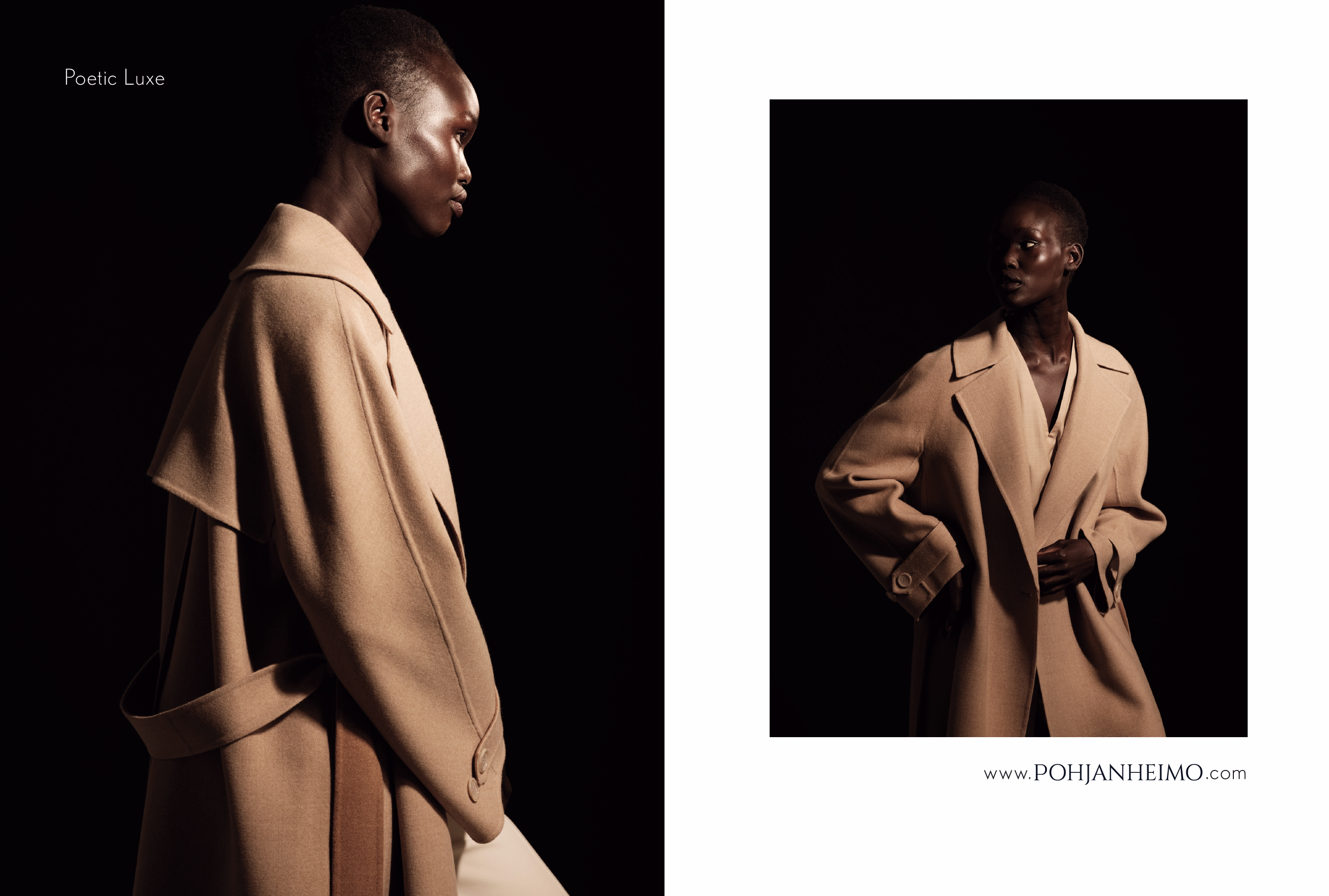
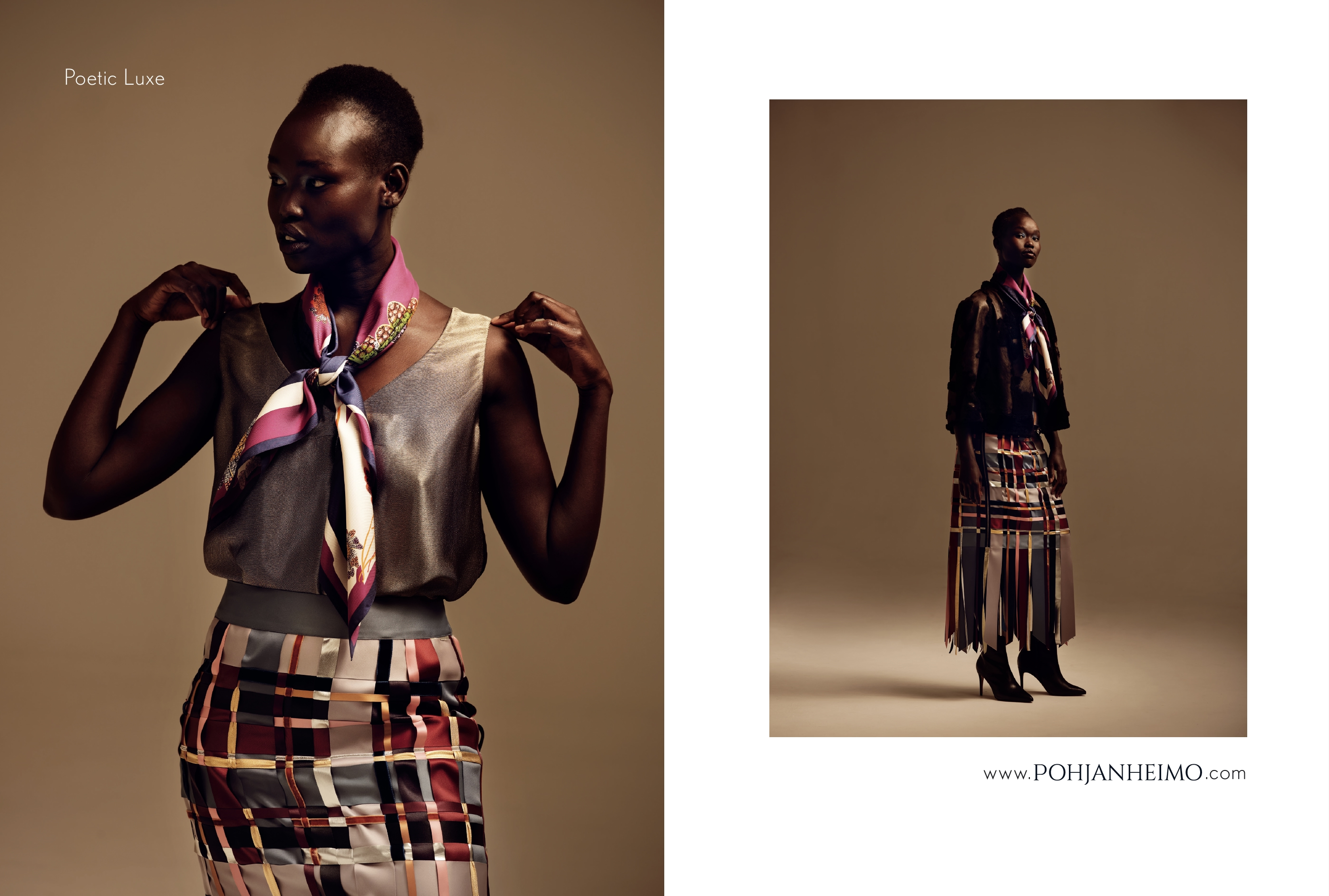
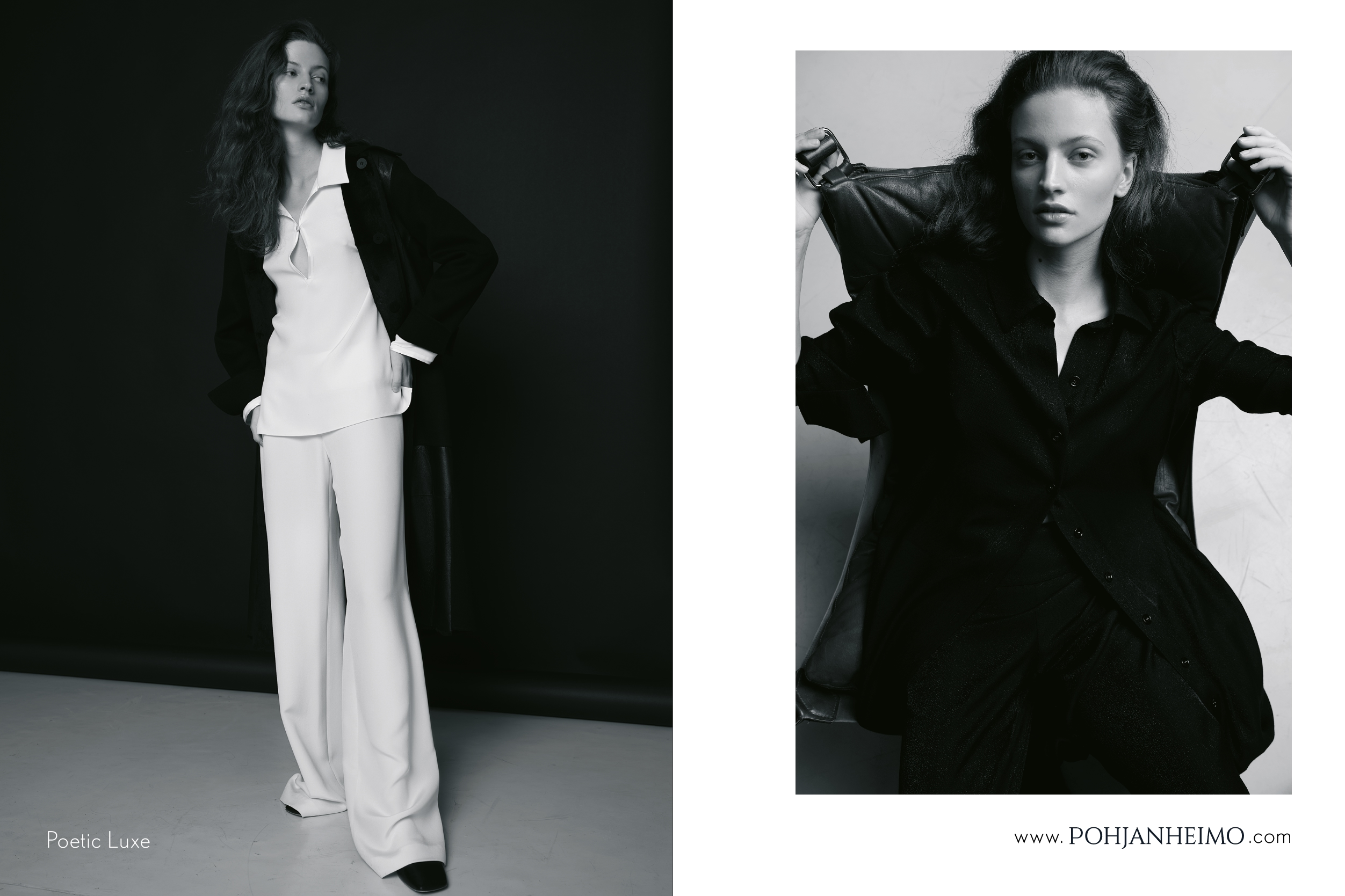
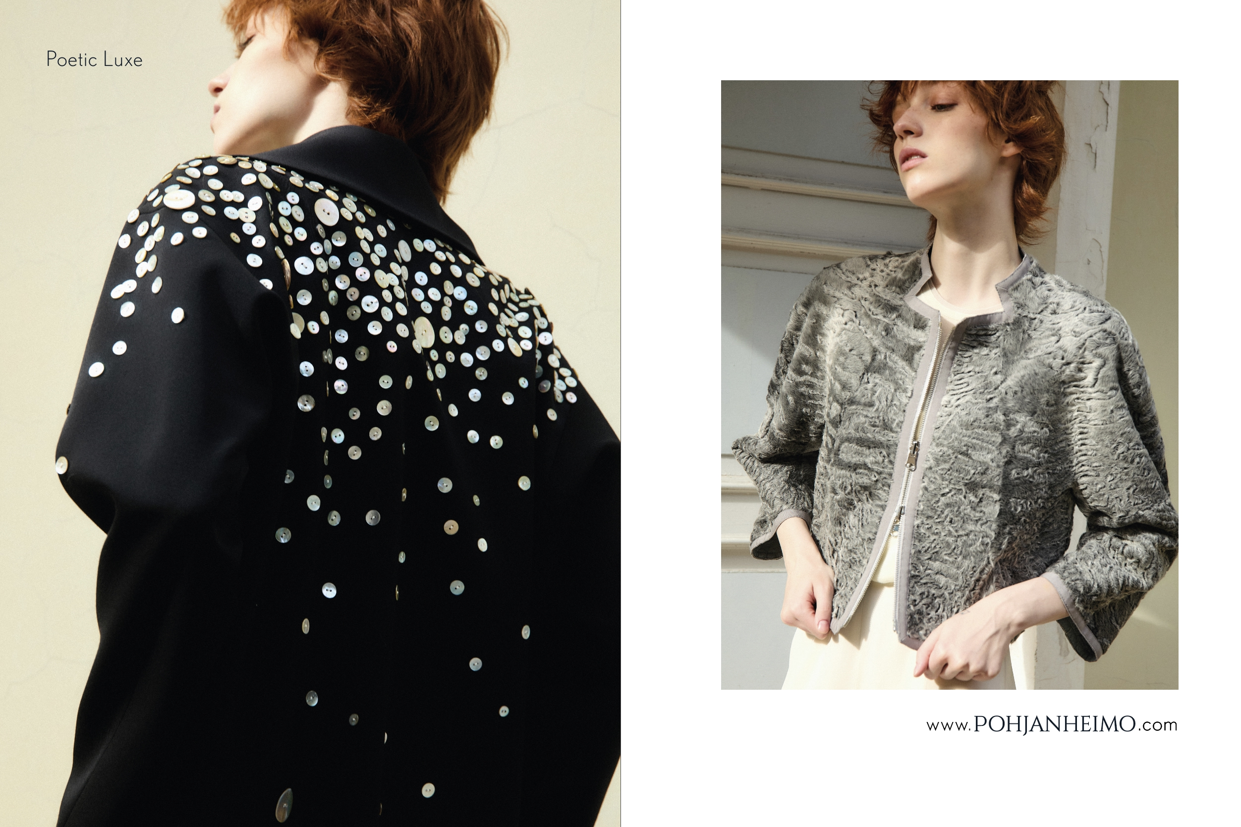
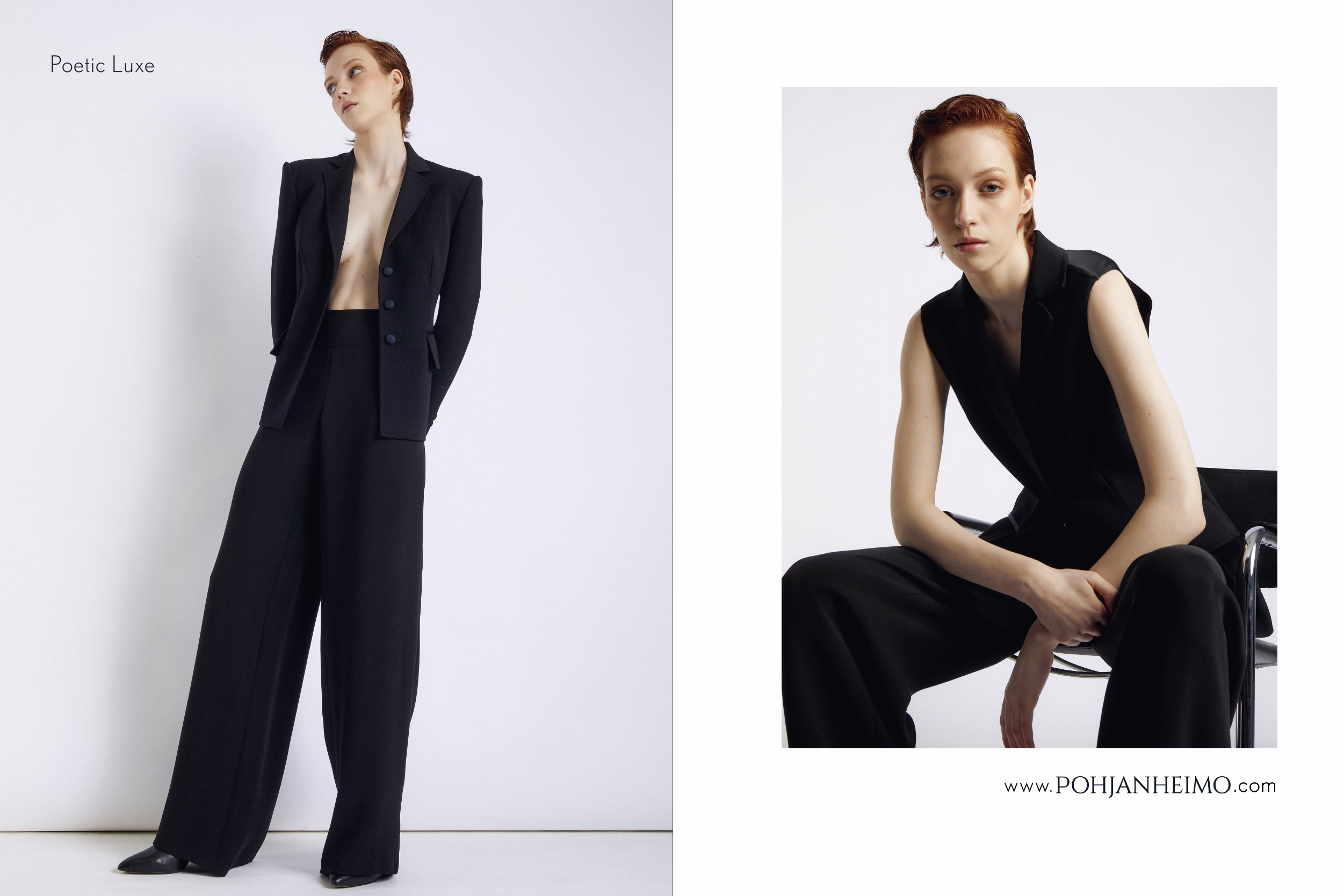
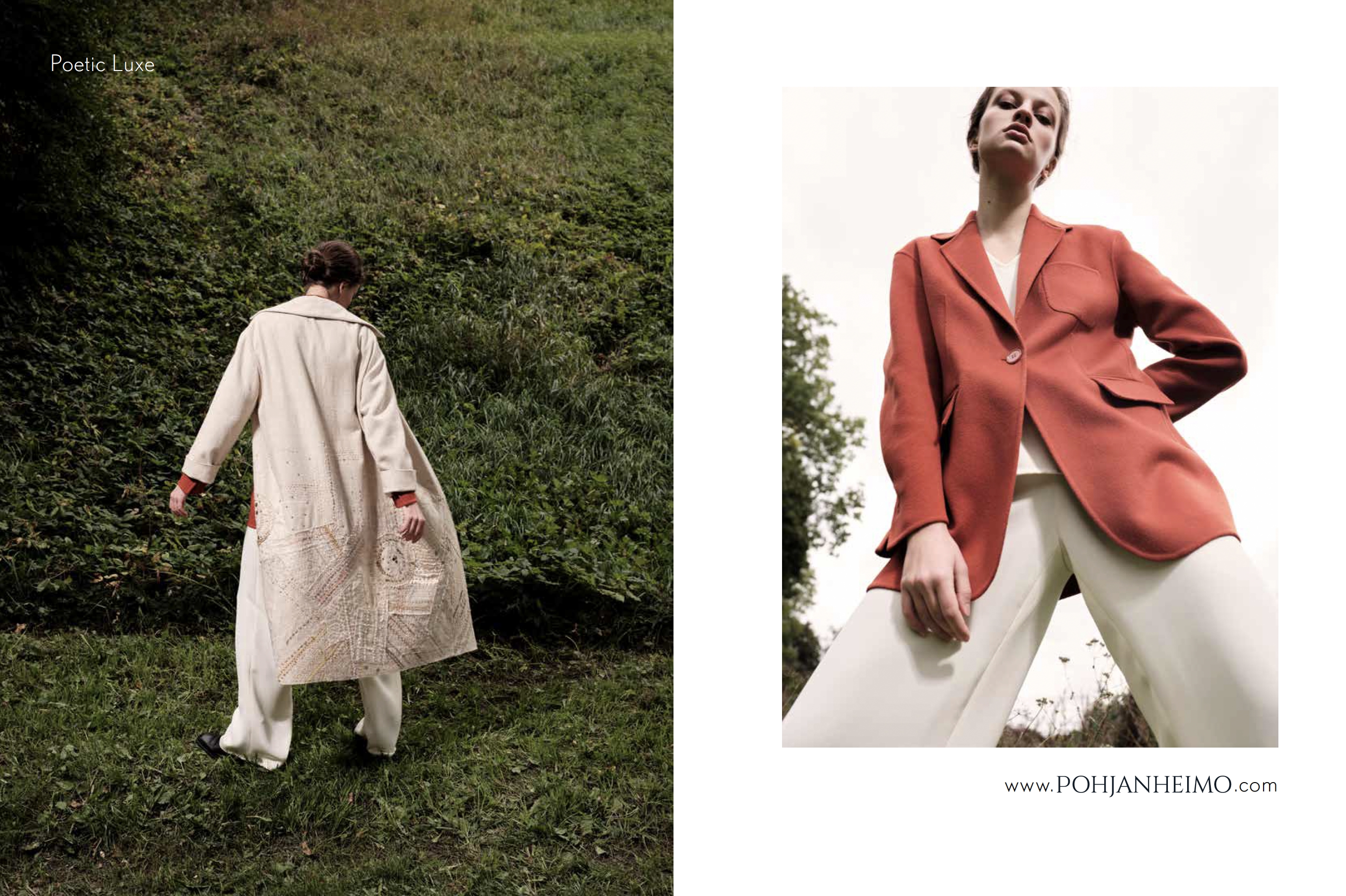
Poetic Luxe
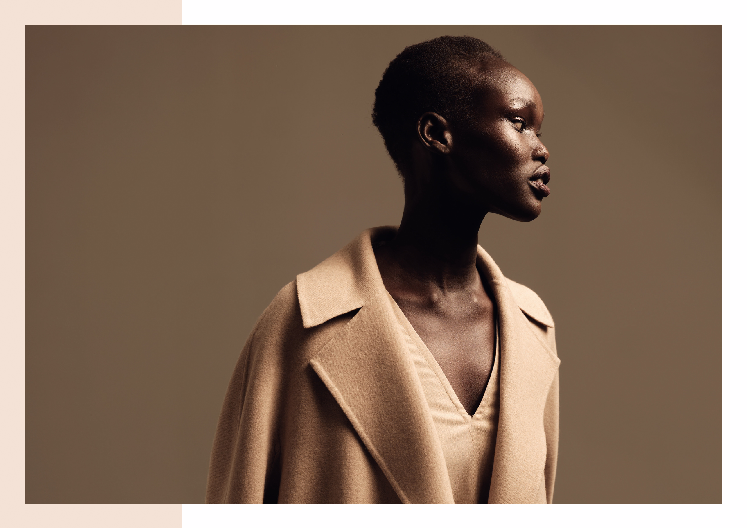
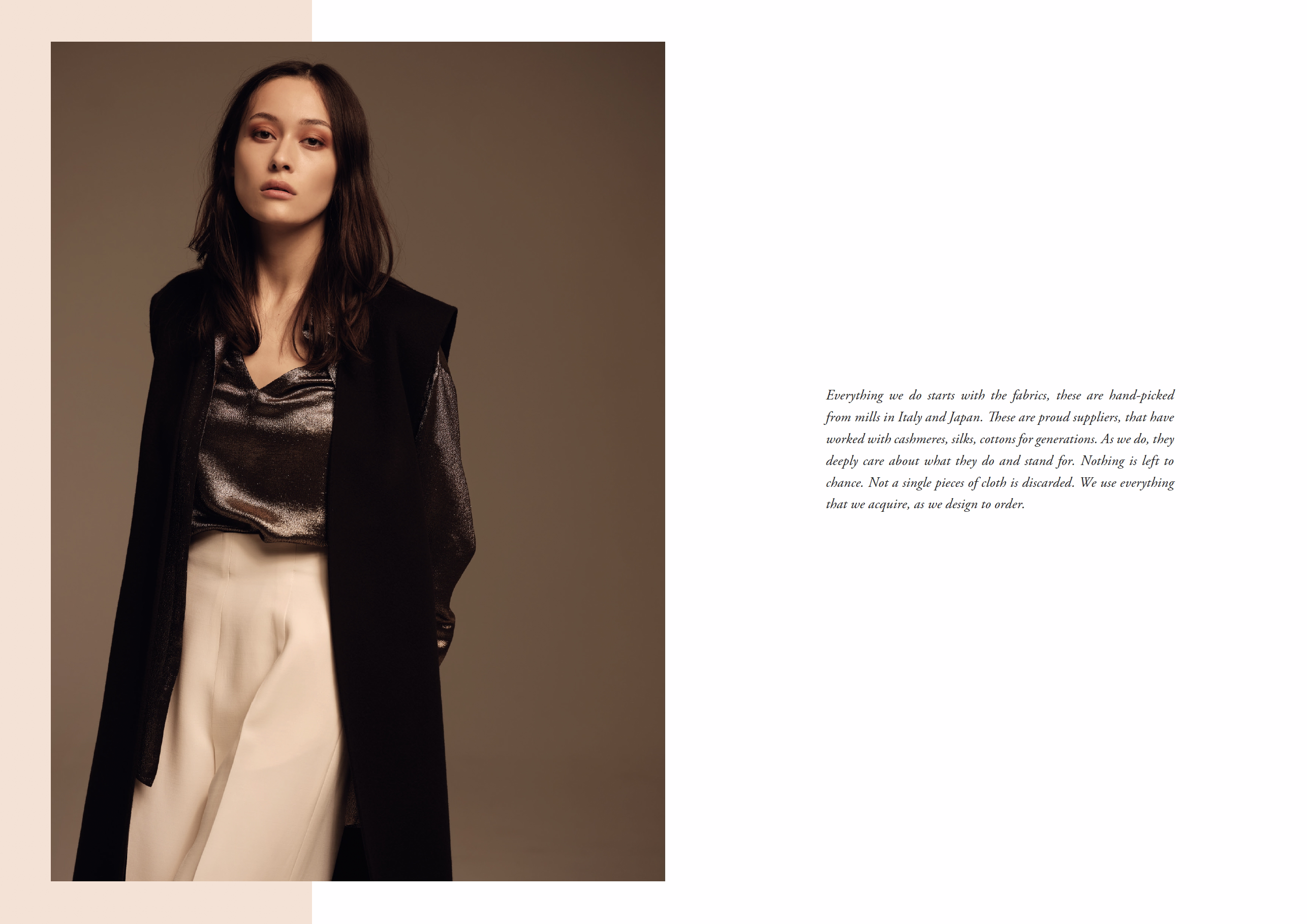
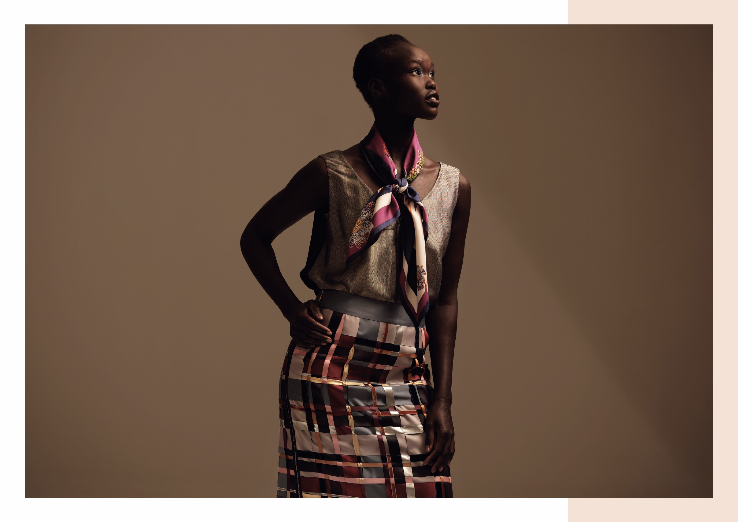
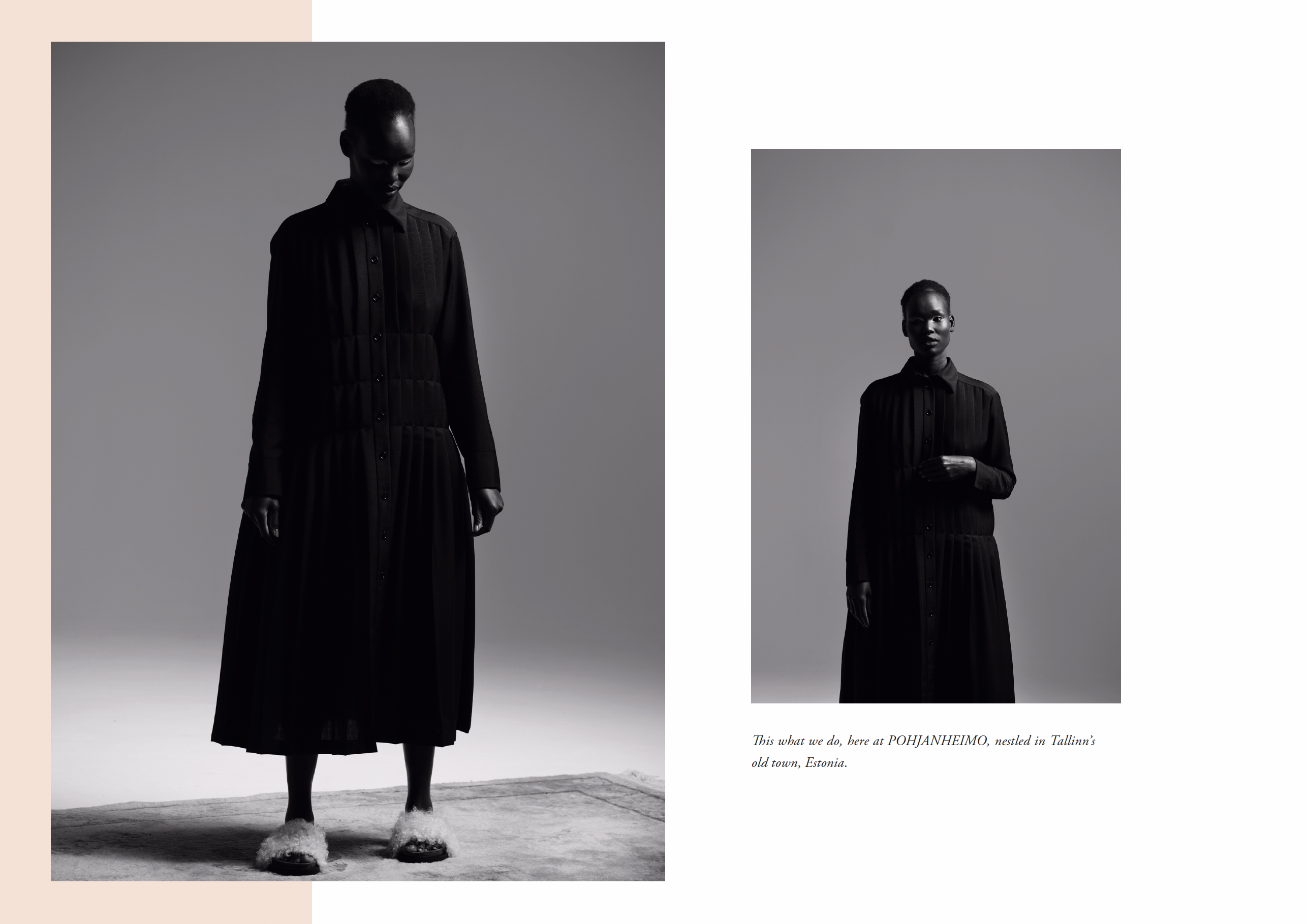
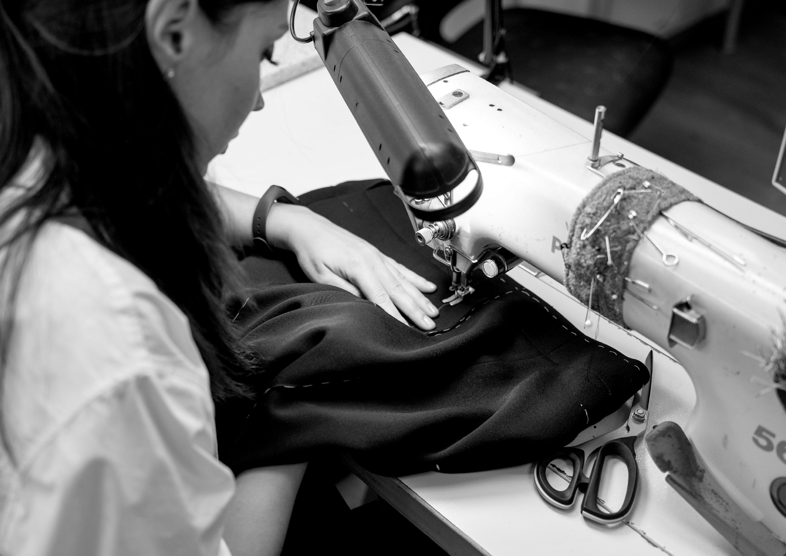
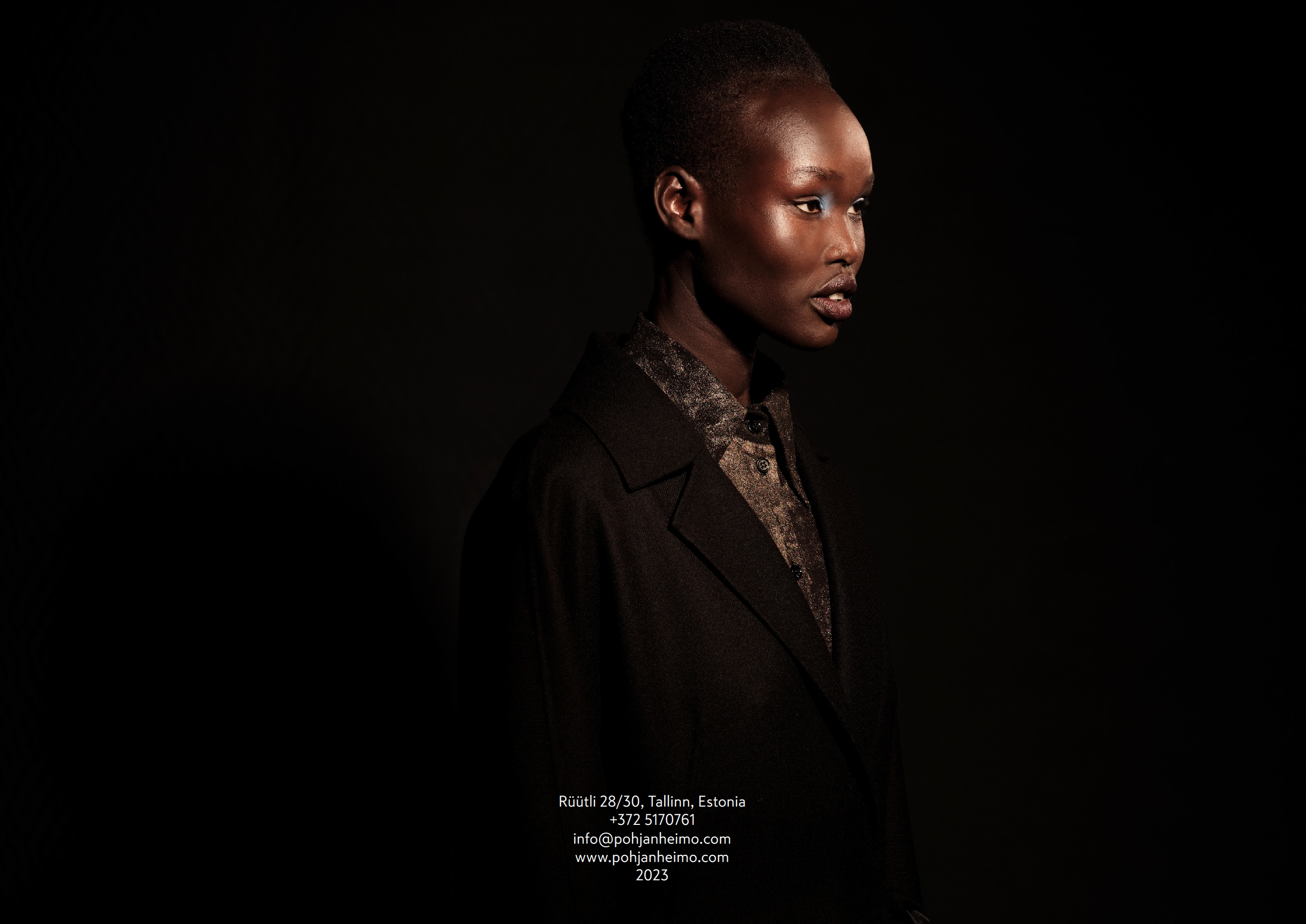
Pohjanheimo is a luxury womenswear ateliér, based in Tallinn, Estonia. We embrace responsible design that is season-less and constructed to last a lifetime.
For the past six years, I have designed a wide range of materials for POHJANHEIMO, including lookbooks, line sheets, event invitations, product tags, website design, and a series of print ads for SÄDE magazine. The SÄDE magazine ad layouts are intentionally consistent and restrained. Since the photographs — captured by renowned photographers — are artistic works in their own right, the design ensures they take center stage. The photos have been carefully selected and thoughtfully paired to ensure they complement each other and support the visual narrative. Additionally, the layout is crafted to be immediately recognizable as Pohjanheimo and to reflect that these ads are part of an ongoing series. A new ad appears in every issue of the magazine.
LOOKBOOK


magazine ads


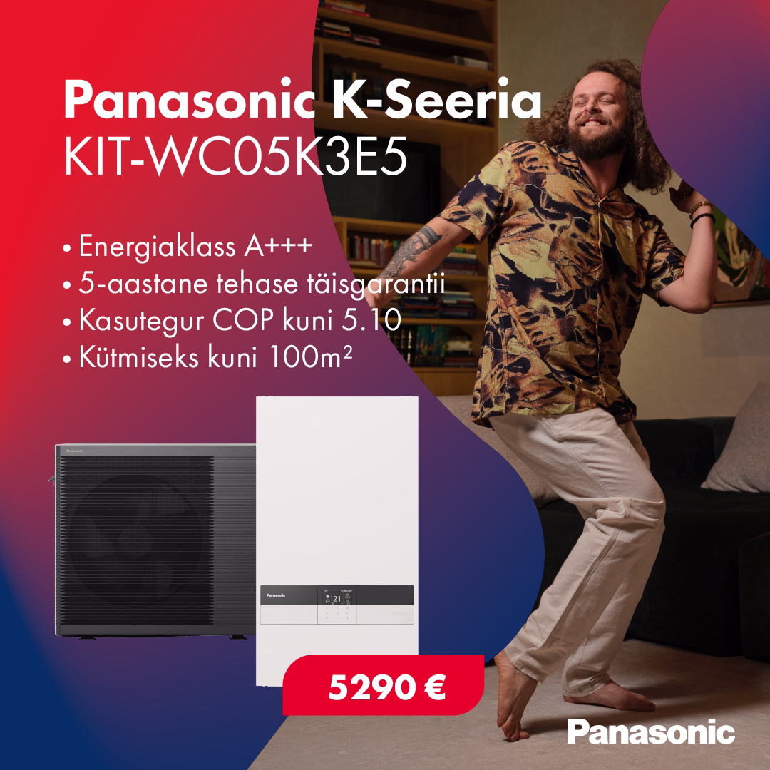
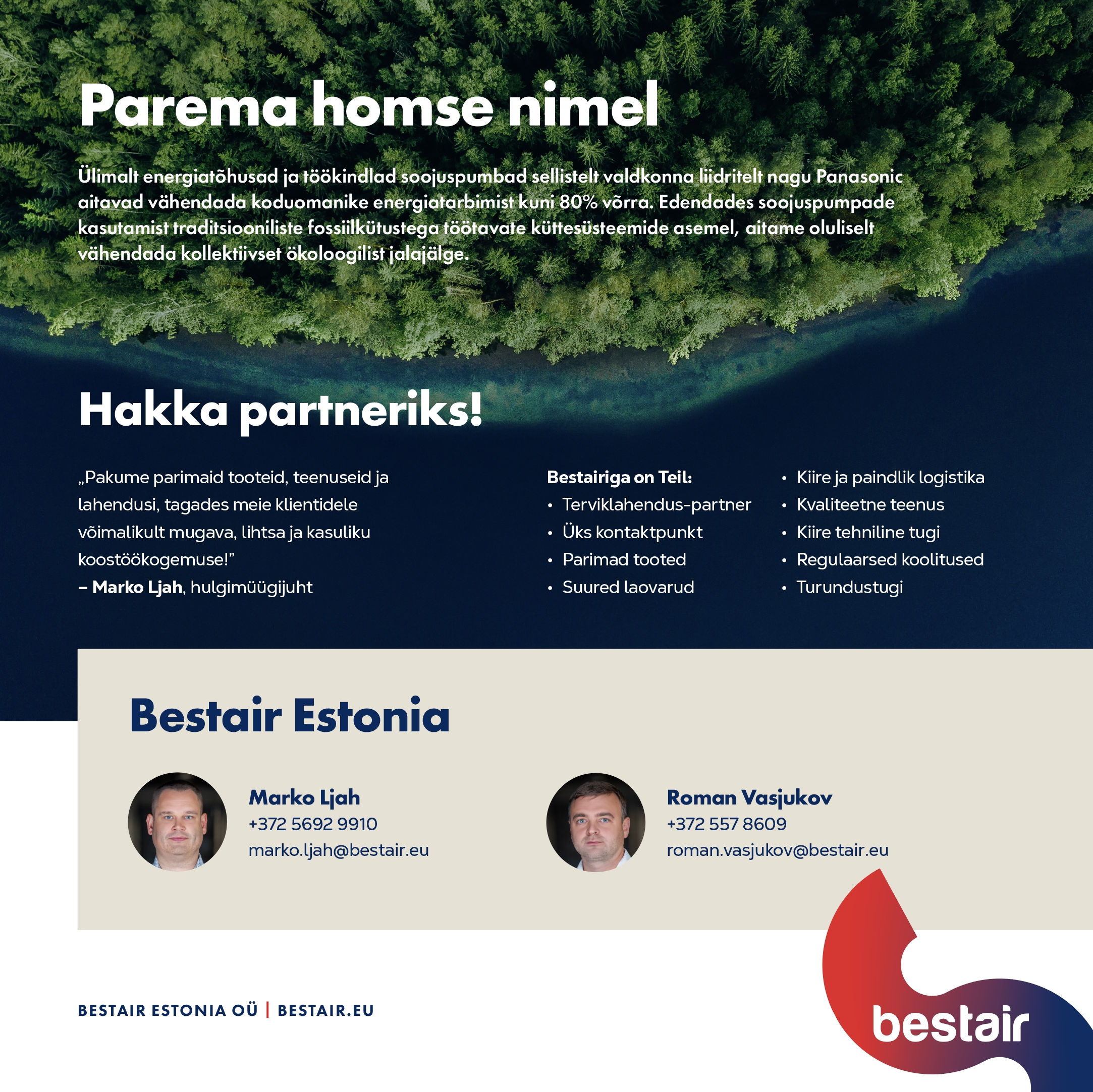
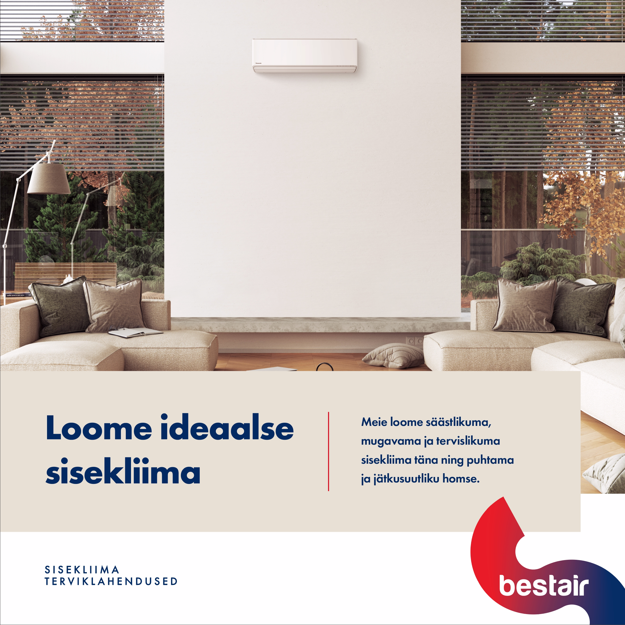
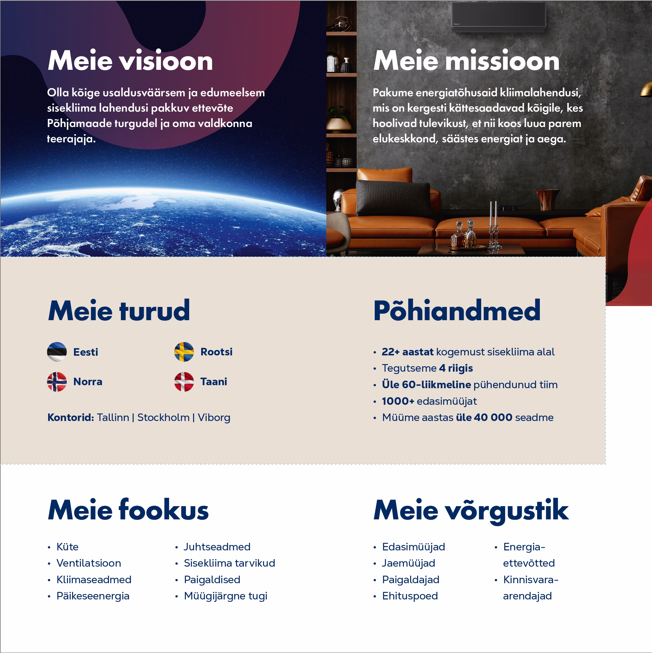
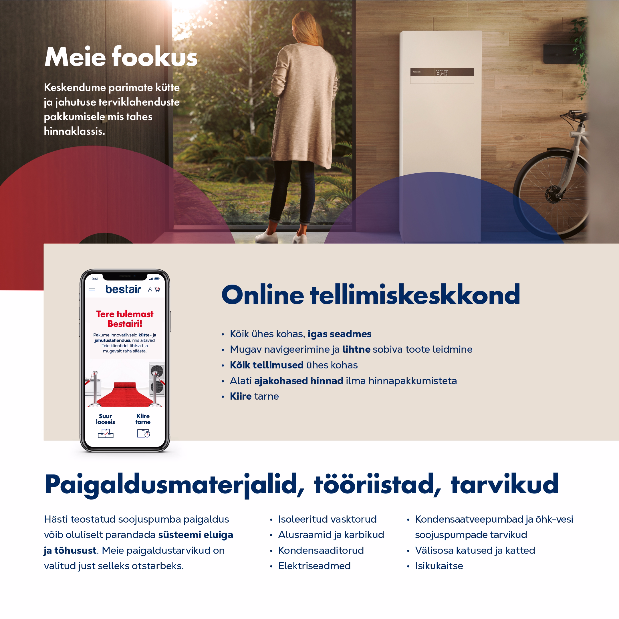
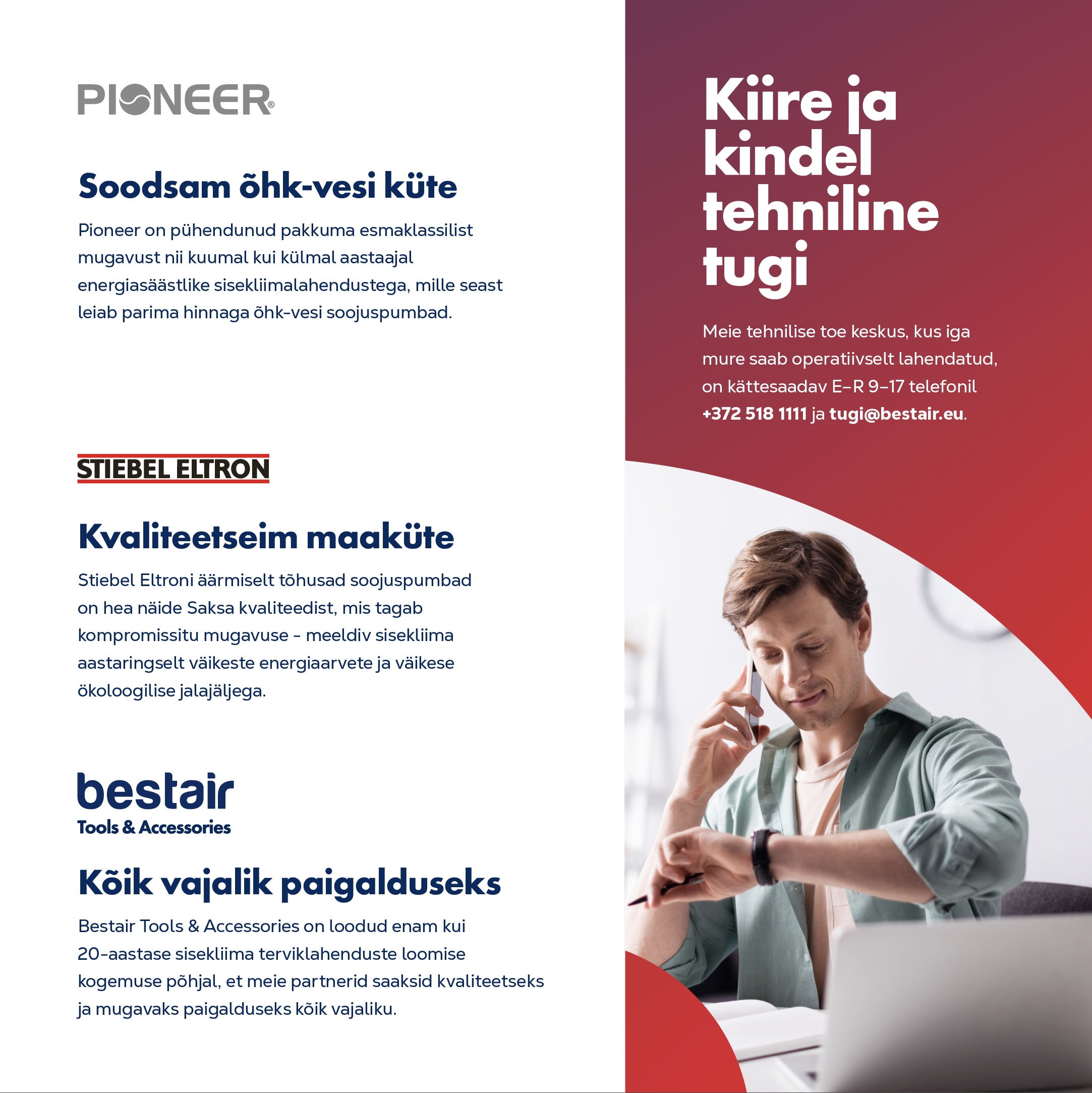
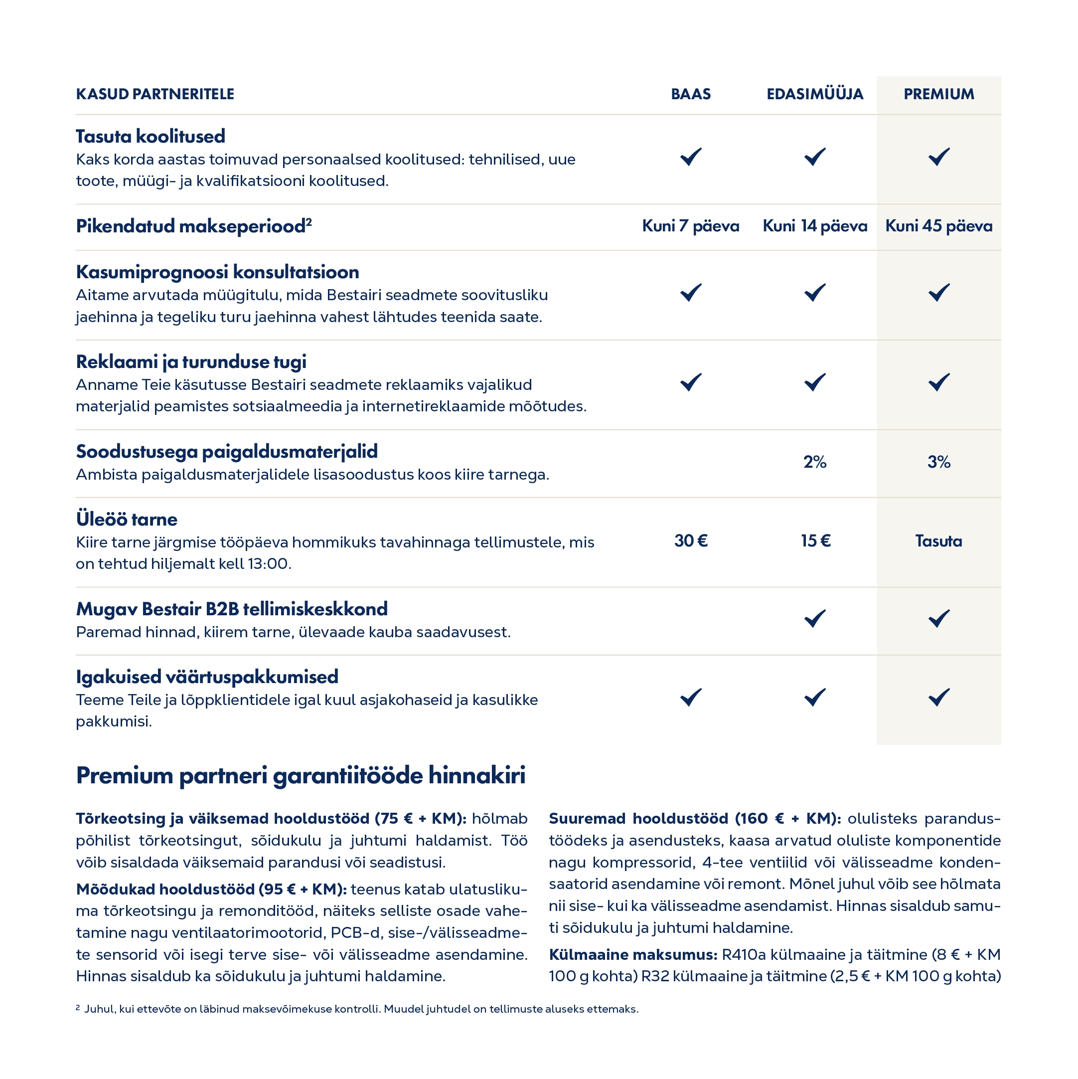
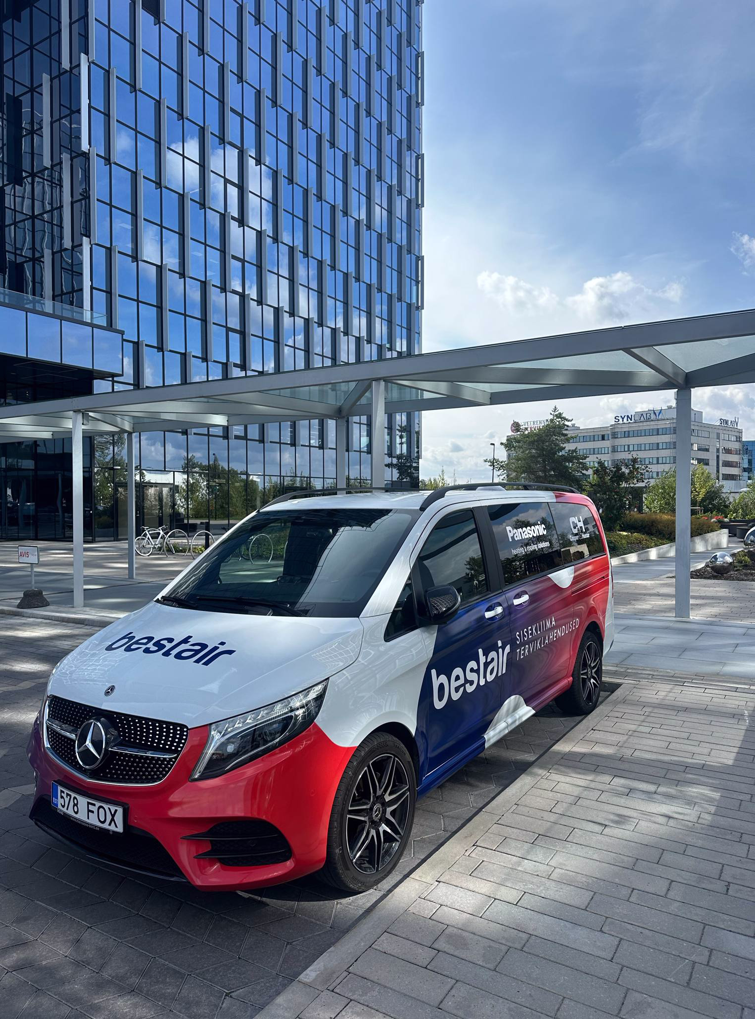
Bestair is one of the leading indoor climate solution providers in the Nordic region. Founded in 2002 in Estonia, the company is committed to quality and innovation to ensure the best possible indoor climate for its customers. Every year, more than 40,000 people in Estonia and across the Nordics choose Bestair for their energy-efficient, all-in-one indoor climate solutions.
In 2024, Bestair launched a new corporate visual identity (CVI). My role was to align all of the company's marketing materials with this fresh new style. This included implementing the new gradient-based logo, gradient backgrounds, and an S-shaped design element that needed to be creatively integrated across various formats. I created social media banners, designed the company's vehicle graphics, outdoor advertisements, and exhibition stands. I also redesigned essential office documents and quotation templates. Business cards, stickers, thank-you cards, T-shirts, notebooks, and even socks – all were refreshed to match the new visual identity. Additionally, I produced advertisements for magazines.
social media


Print - outdoor

PRINT - b2b


vehicle wrap design

Chanz – The Social Casino Experience
Born from a vision to reshape the online casino landscape, Chanz stands for fair play, fun, and friendship. As the world’s first truly social casino, Chanz allows players to create profiles, make friends, share achievements, and engage in a vibrant, community-driven environment.
I shaped the Chanz brand identity by designing consistent UI elements, visual styles, and promotional assets that reflected its playful and social nature. My experience at Chanz sharpened my expertise in digital design, UX/UI aesthetics, and fast-paced campaign production — all within a dynamic and rapidly evolving gaming environment.

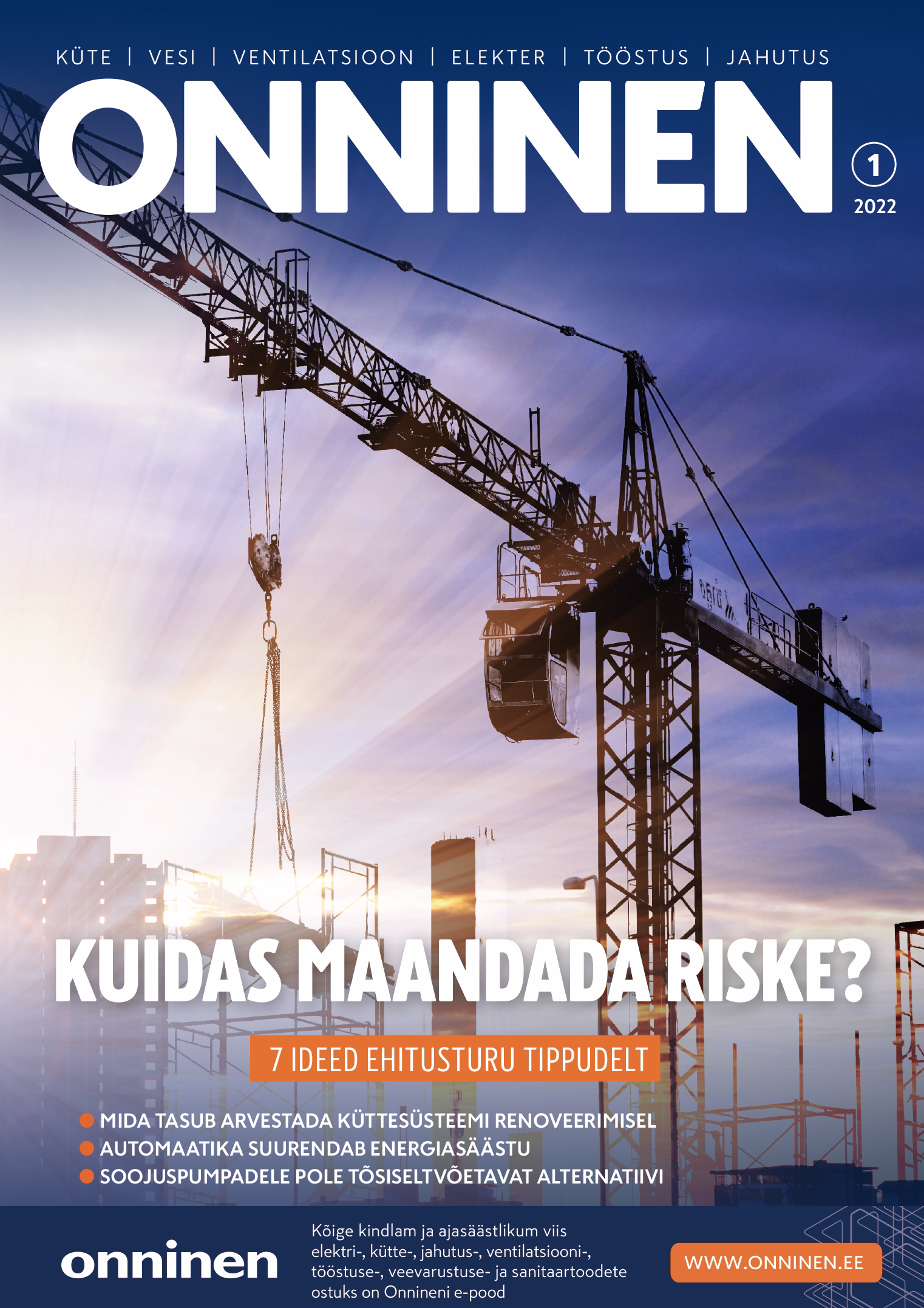
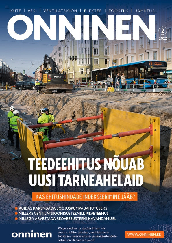
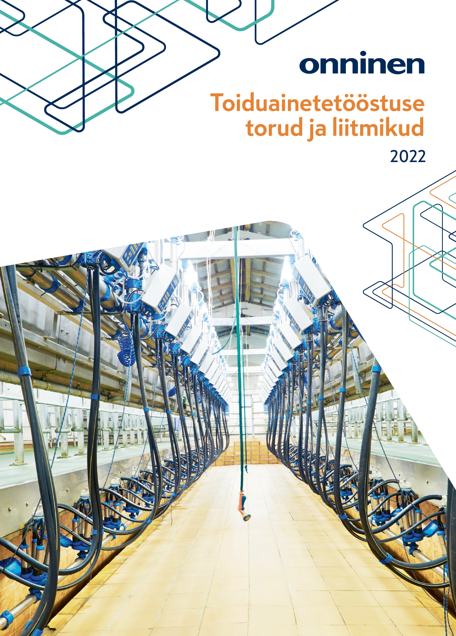
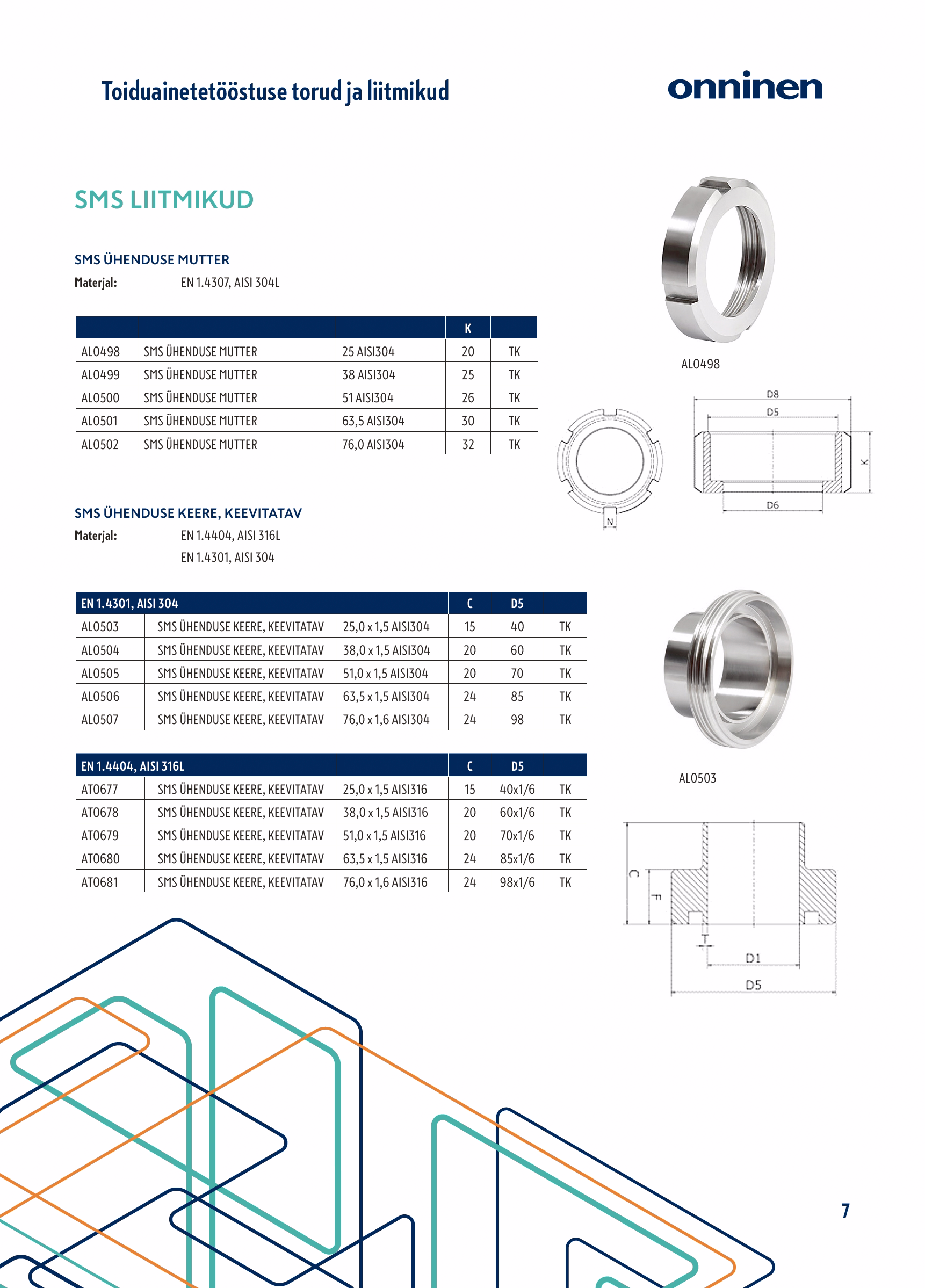
Onninen's Technical Magazine is a quarterly publication in Estonia with a print run of approximately 17,000 copies. Targeted at professionals in general construction and specialized building sectors, the magazine covers a wide range of topics related to construction and energy. Its content is tailored to both industry experts and readers with a broader interest in the field. Each issue is also published online after release.
In 2022, my responsibility was to design and lay out the magazine. Even a technical publication — covering subjects like road construction, building materials, plumbing, heating, and electricity — can be crafted to look visually appealing and engaging.
In addition to the magazine design, I also created roll-up banners, social media graphics, product catalogue, posters, and a holiday greeting card.
magazines

catalogue

print - b2b 2022

print - calendar 2022


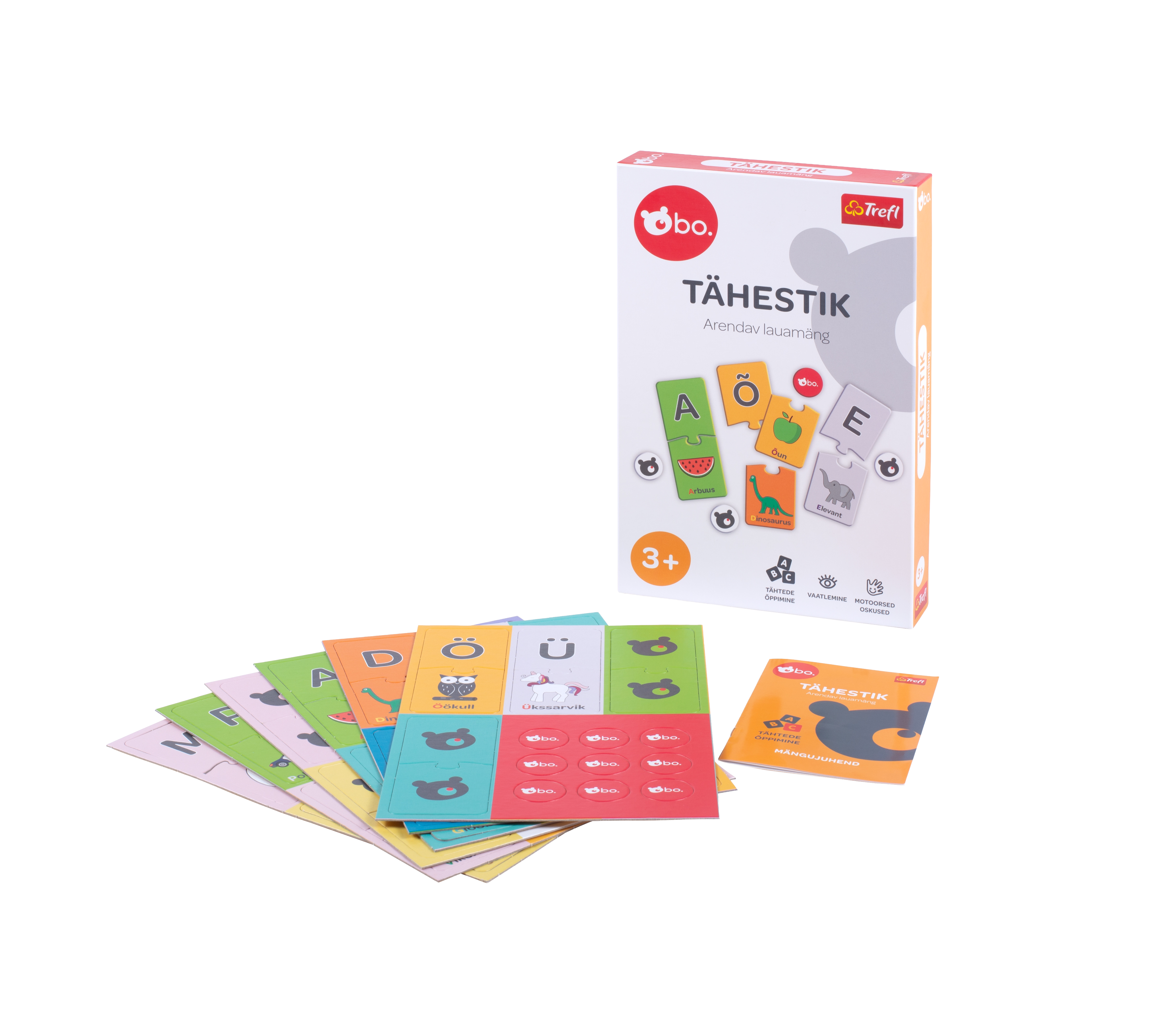
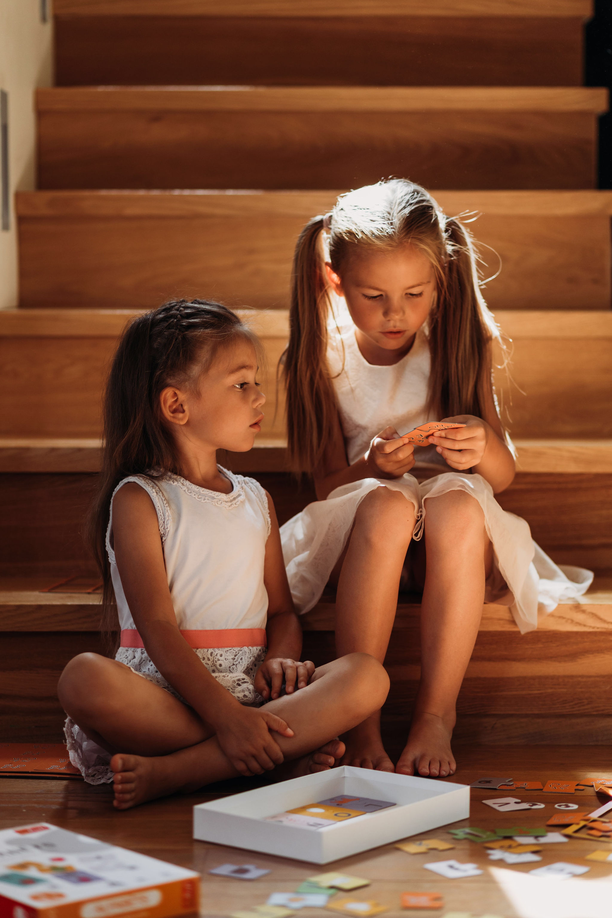
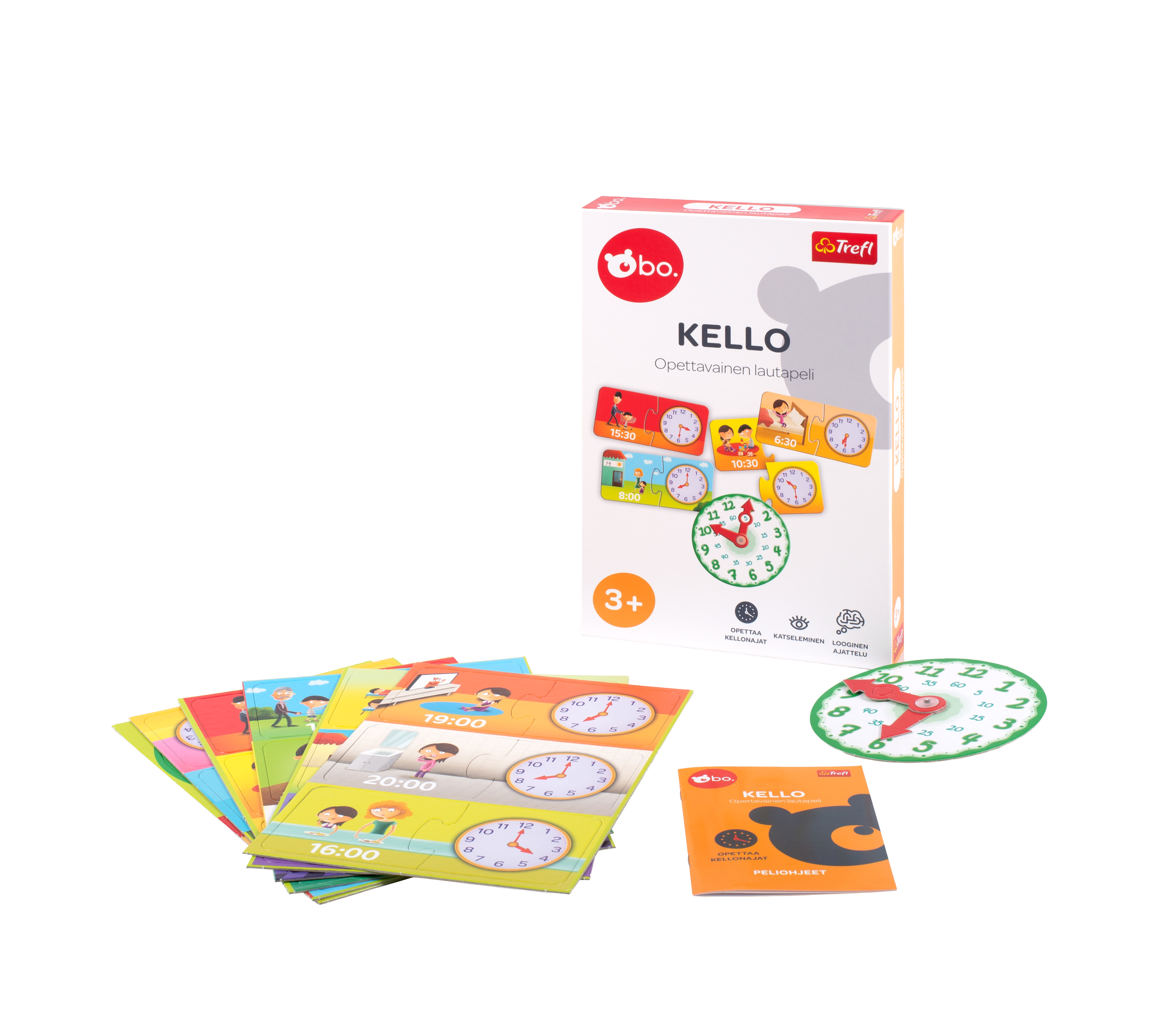
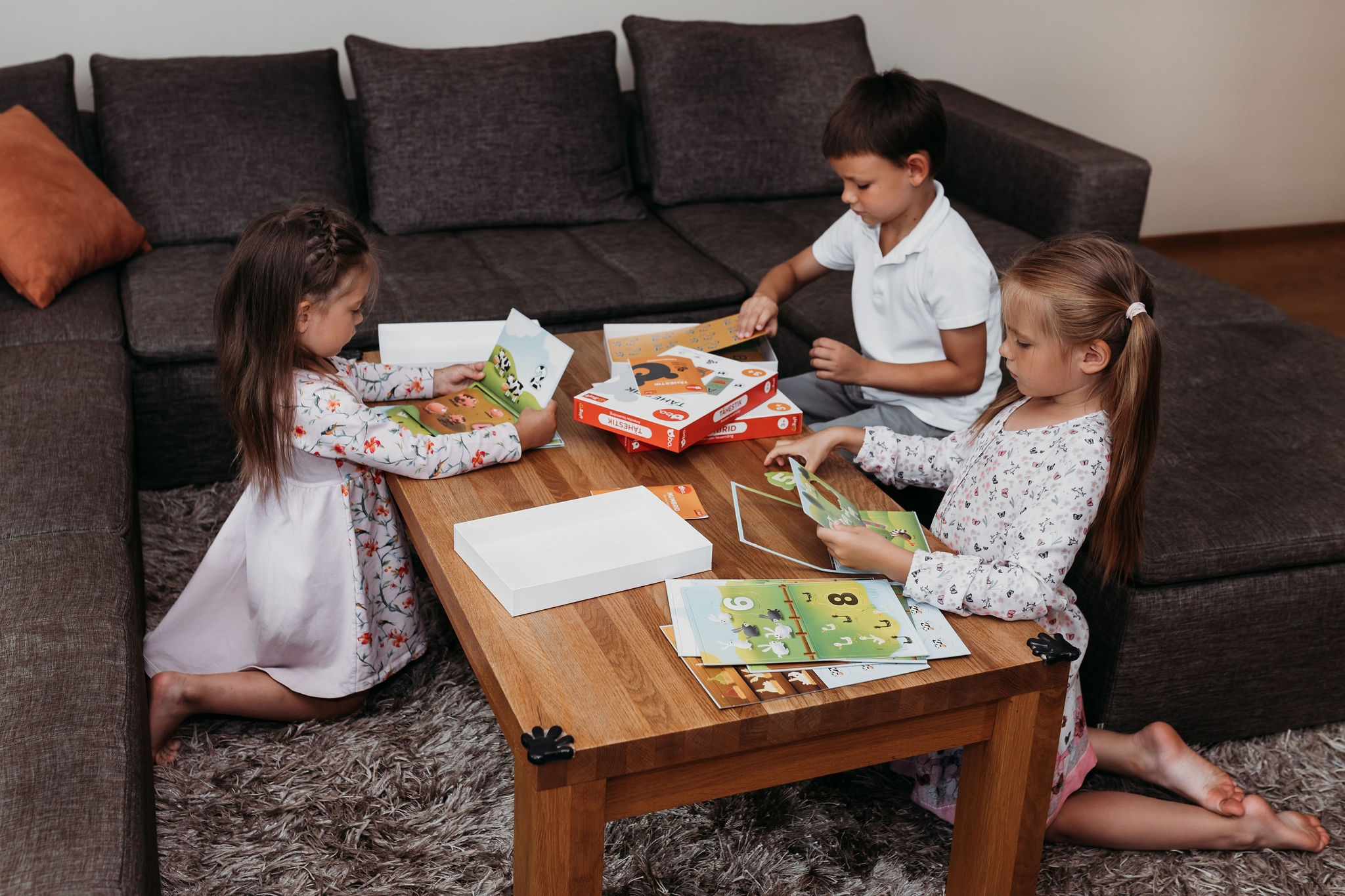
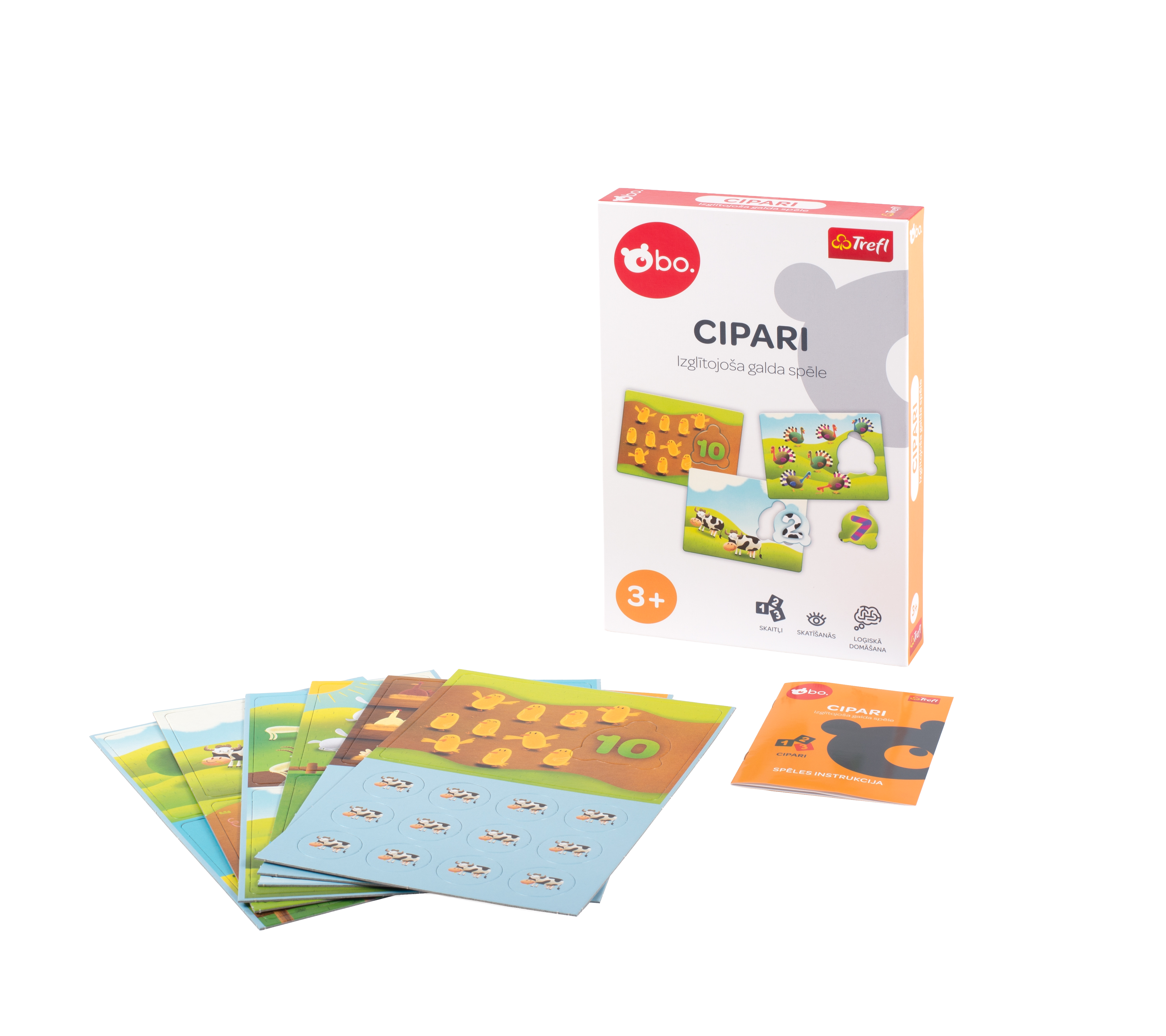
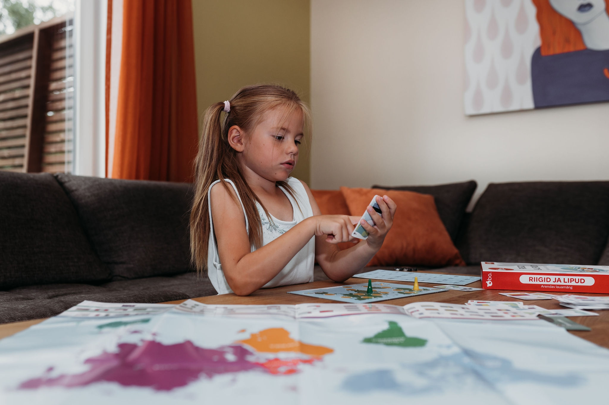
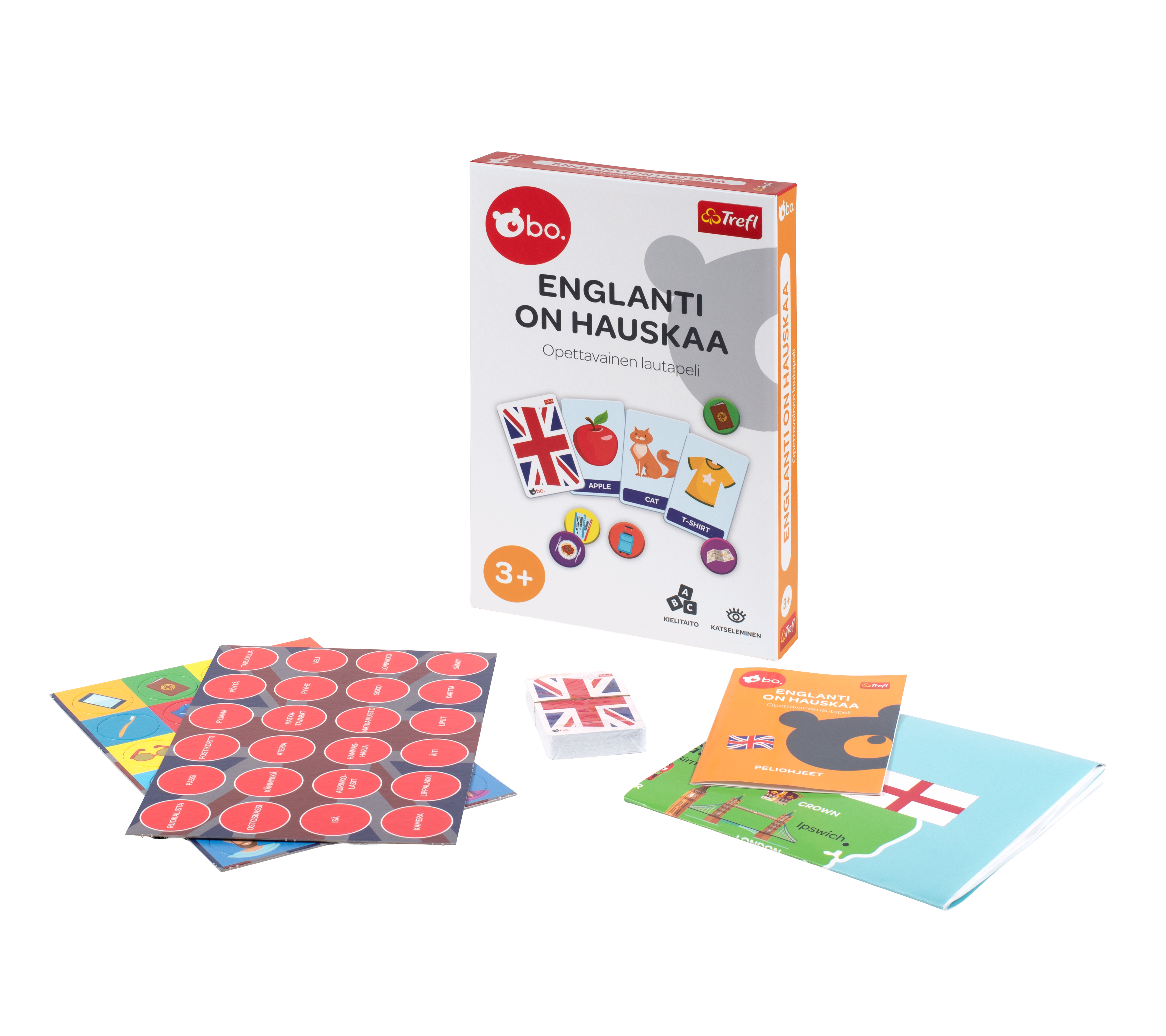
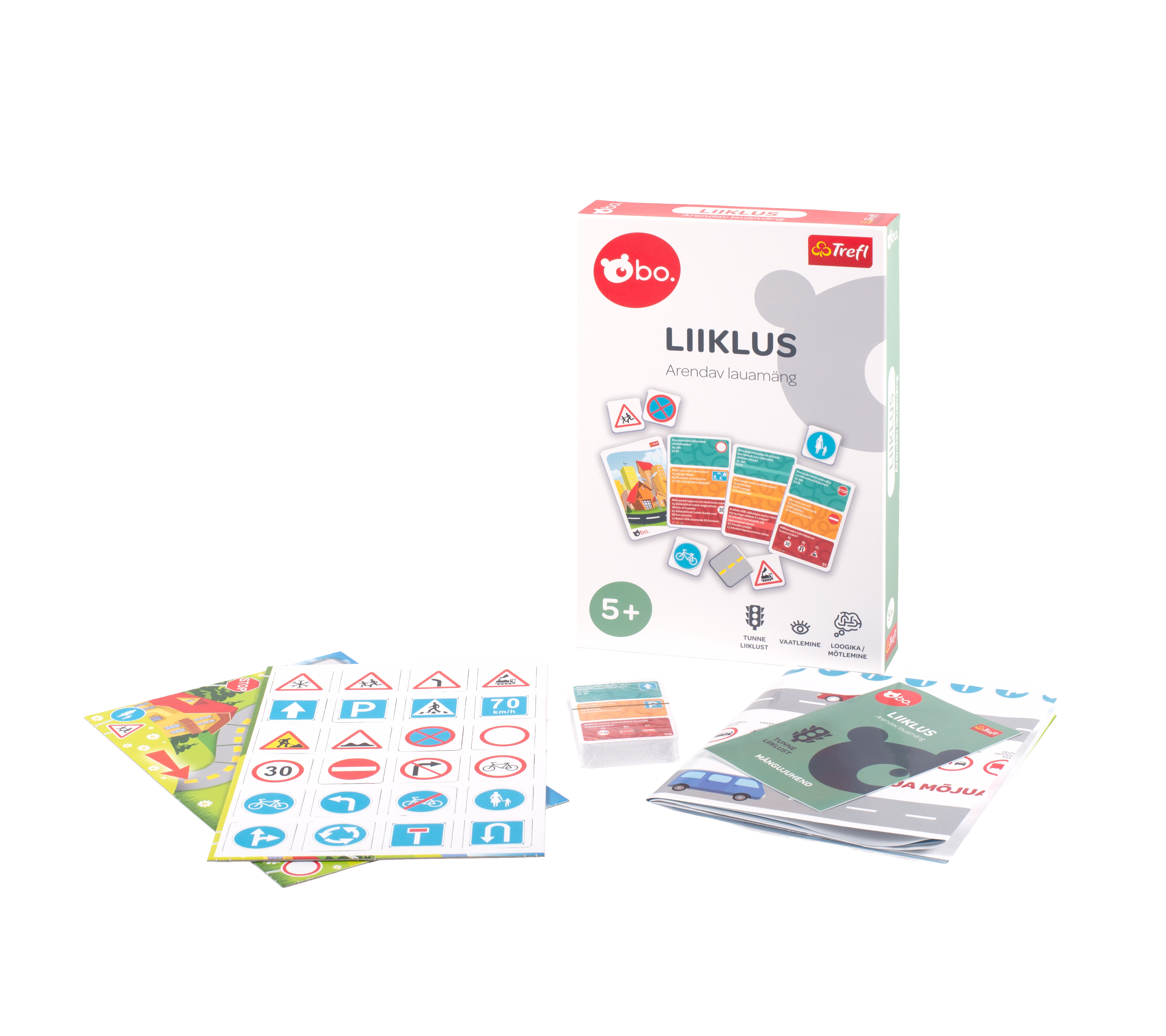
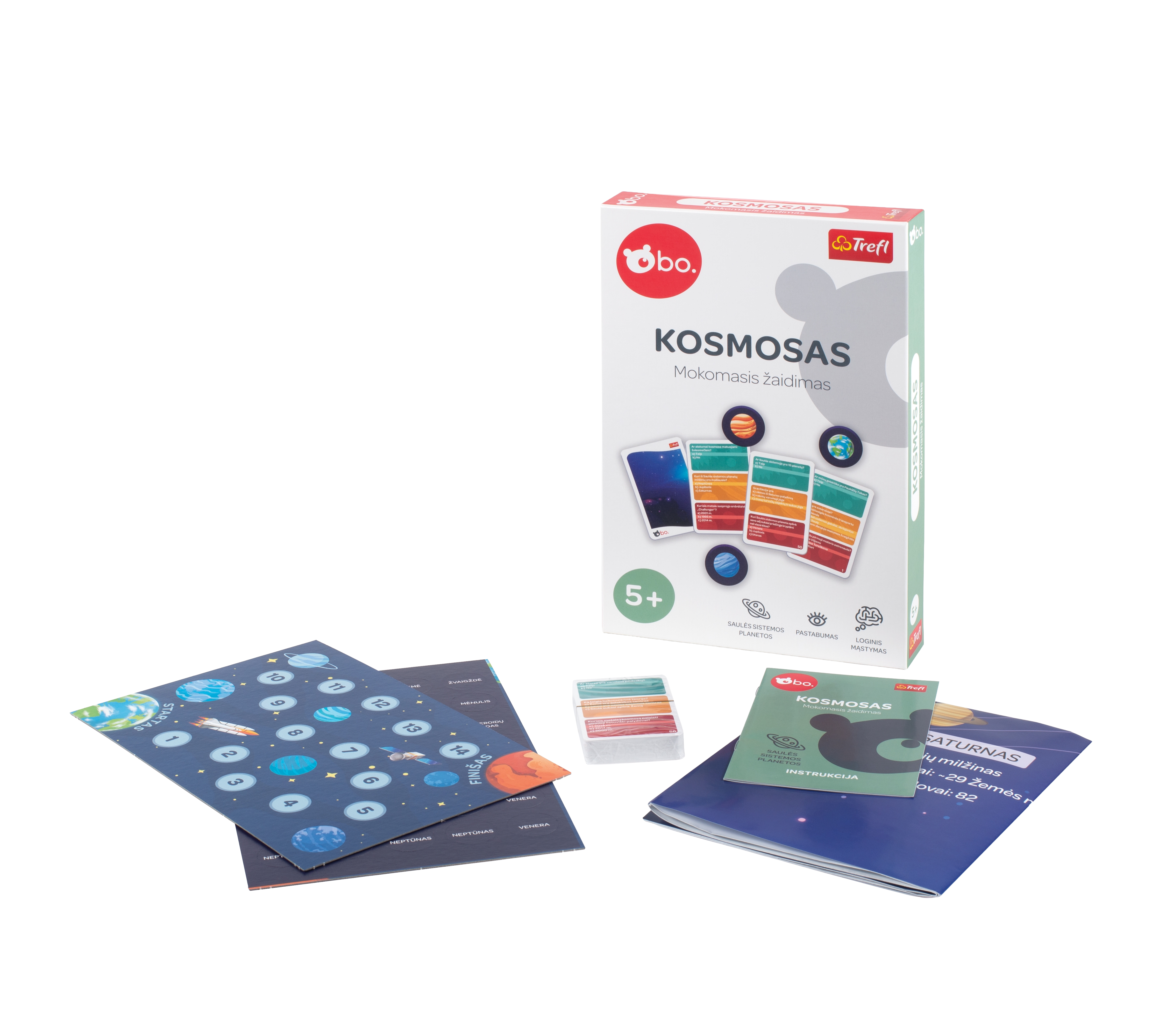
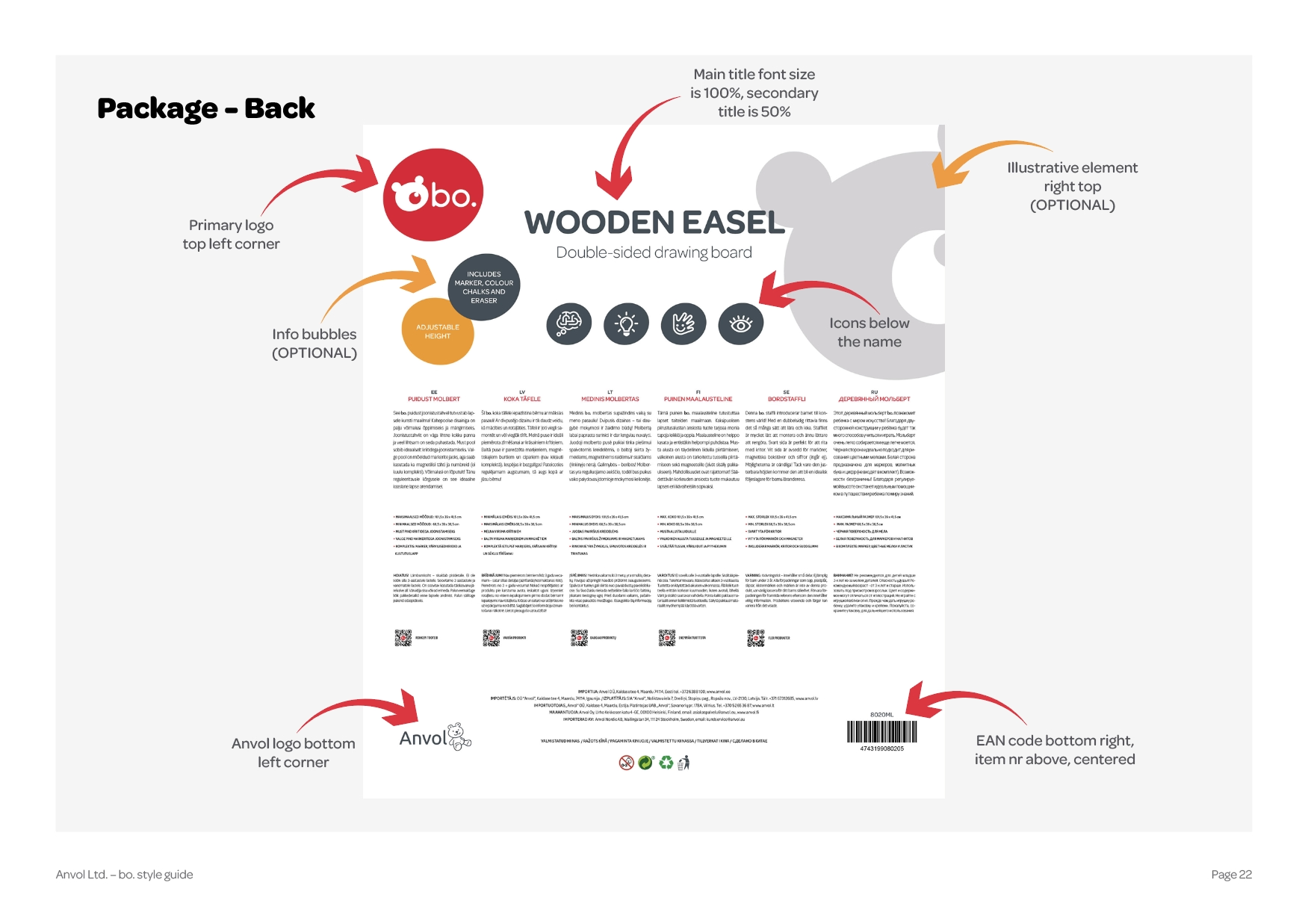
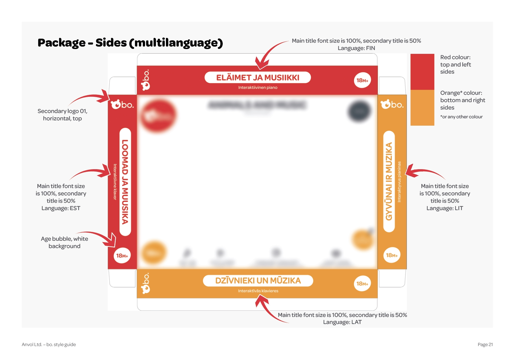
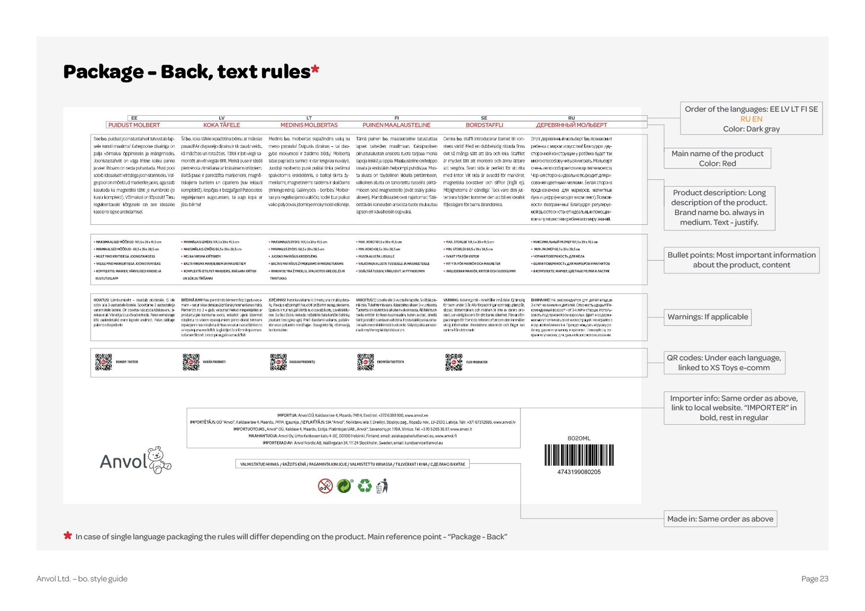
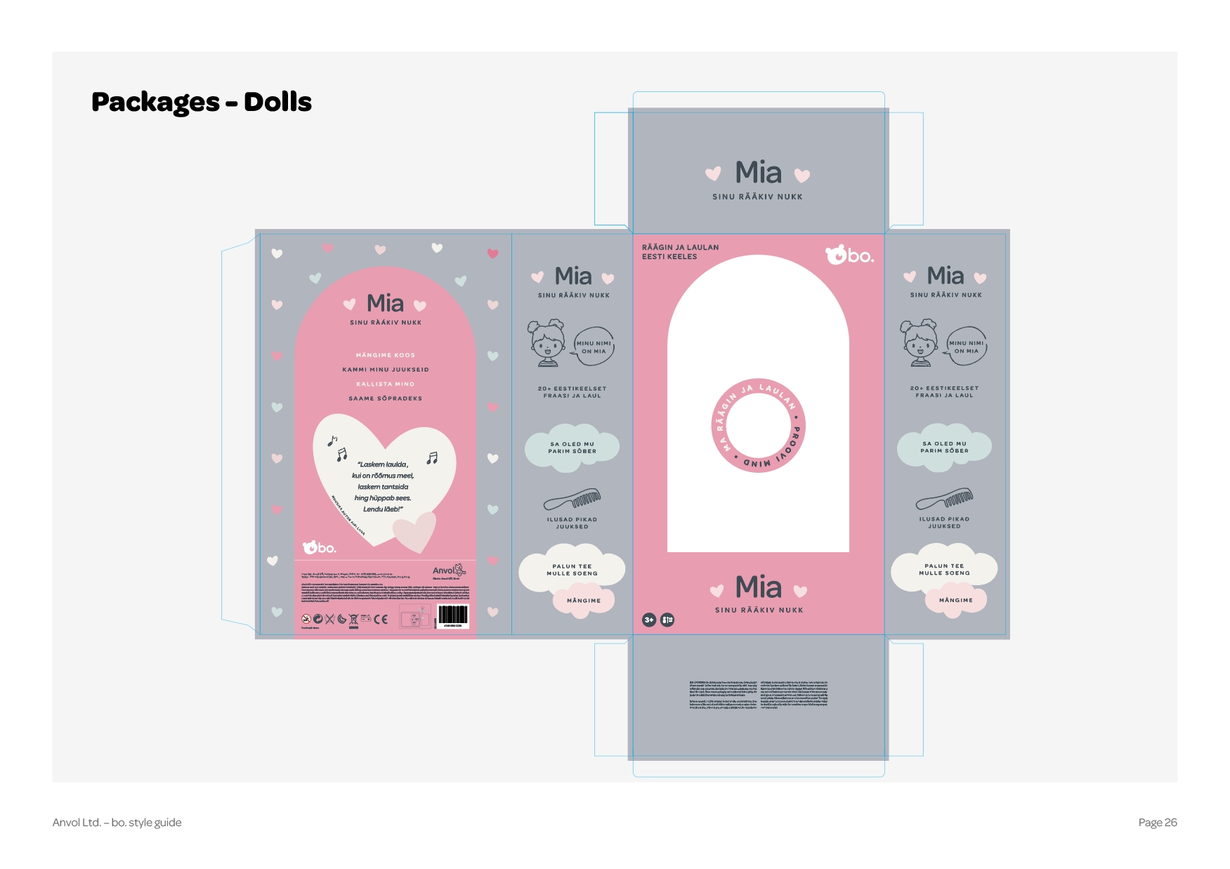
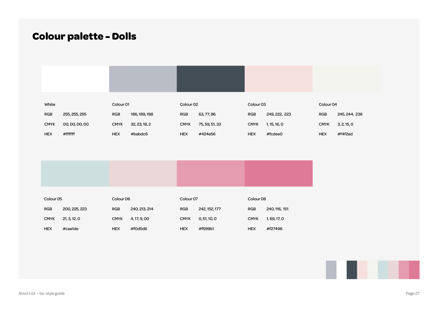
bo. – Where Play Meets Purpose
bo. is more than a brand — it’s a companion in every child’s early journey of discovery. Speaking to children in their own language, both visually and linguistically, bo. combines fun with purpose at every step.The product portfolio includes a wide range of educational items designed to nurture cognitive and intellectual development. Each product is thoughtfully crafted with vibrant colors, clear illustrations, and playful visuals that capture attention and spark curiosity.
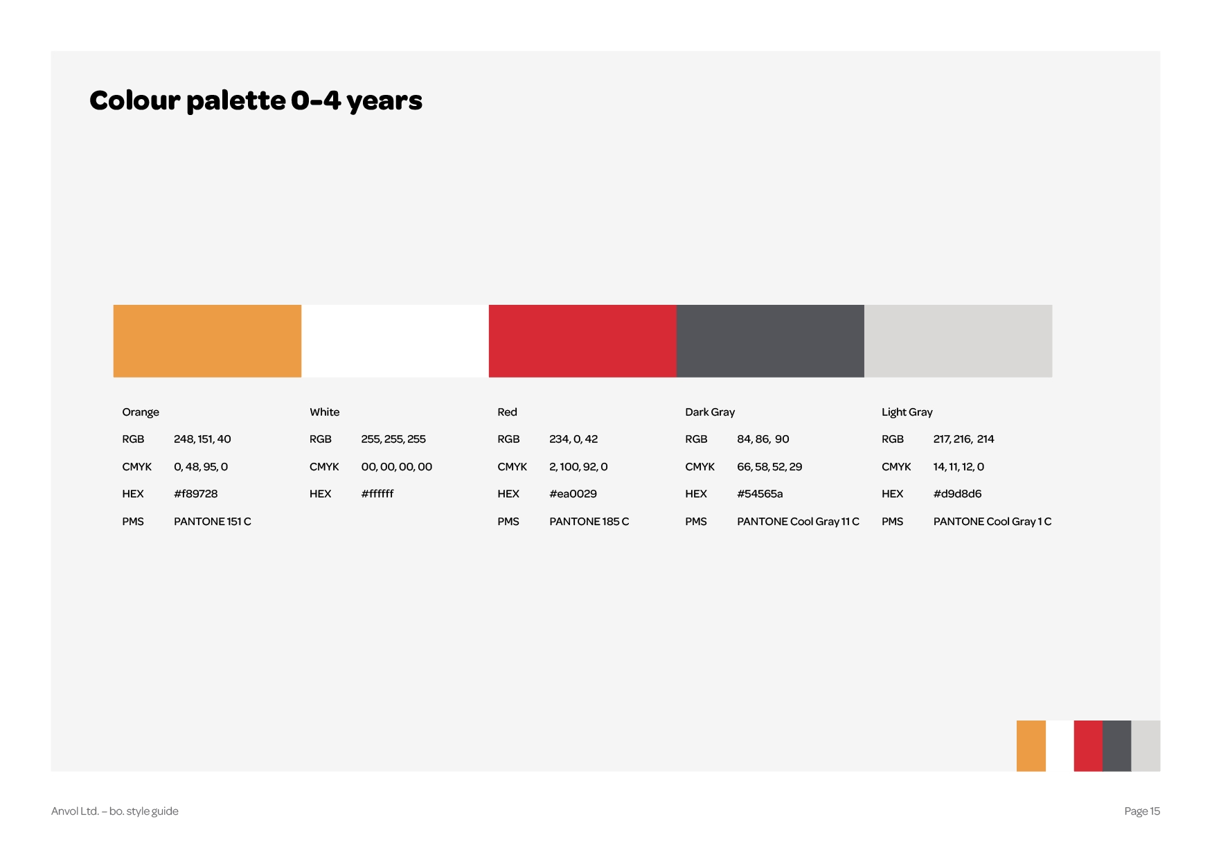
bo. products aim to support learning through joyful engagement, helping children grow their knowledge and skills through hands-on play. Special attention is given to every detail: clean lines, harmonious color palettes, and cheerful, localized designs that resonate across regions. Products under the bo. brand are available in Estonian, Finnish, Latvian, Lithuanian, Russian, Uzbek, and Georgian.
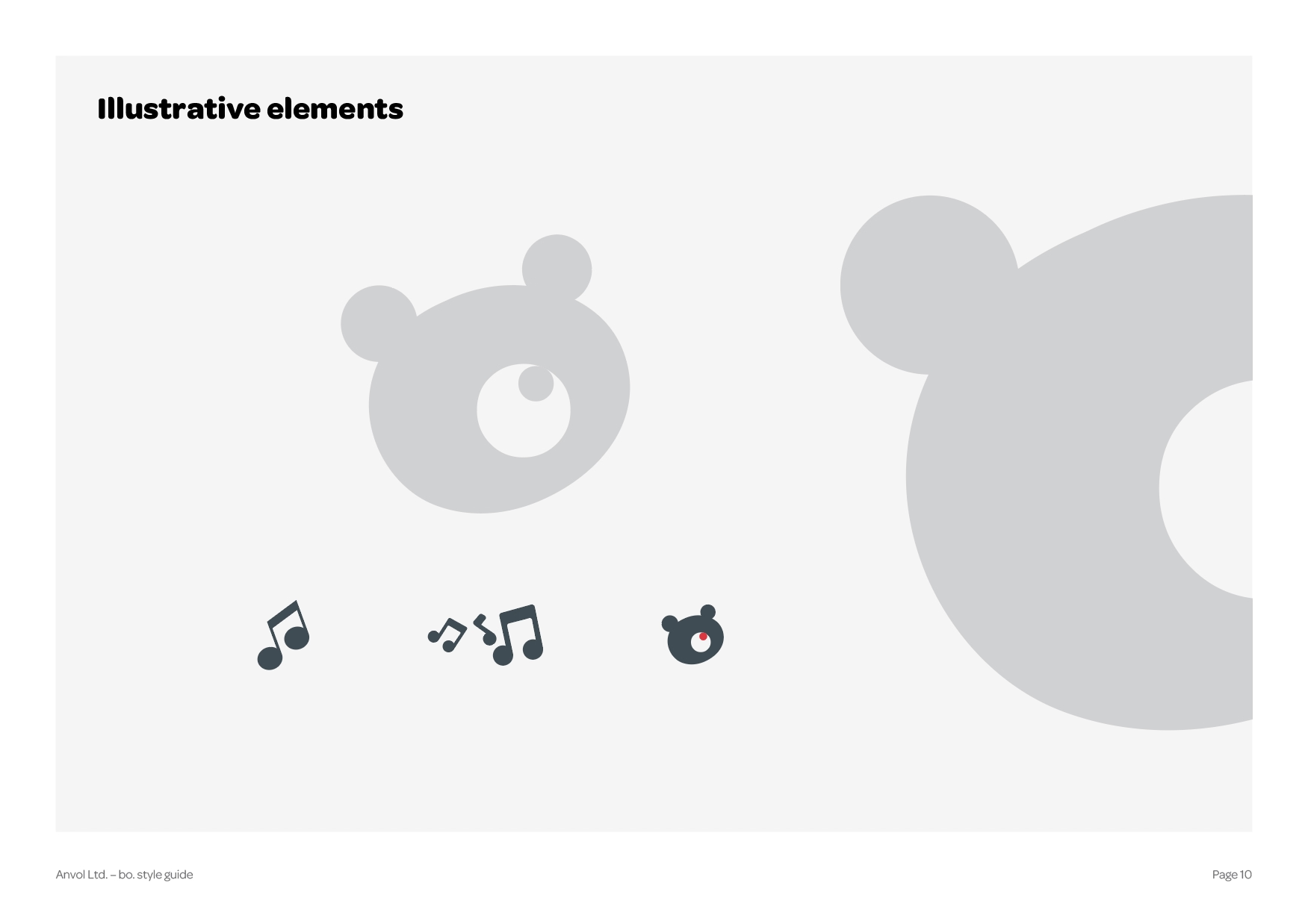
The visual identity of bo. reflects its playful, intelligent, and inclusive nature. From illustrations to color choices, every element is designed to support developmental goals in a way that feels intuitive and joyful to young minds.
bo. looks exactly as it feels – clever, colorful, and inviting.
brand identity


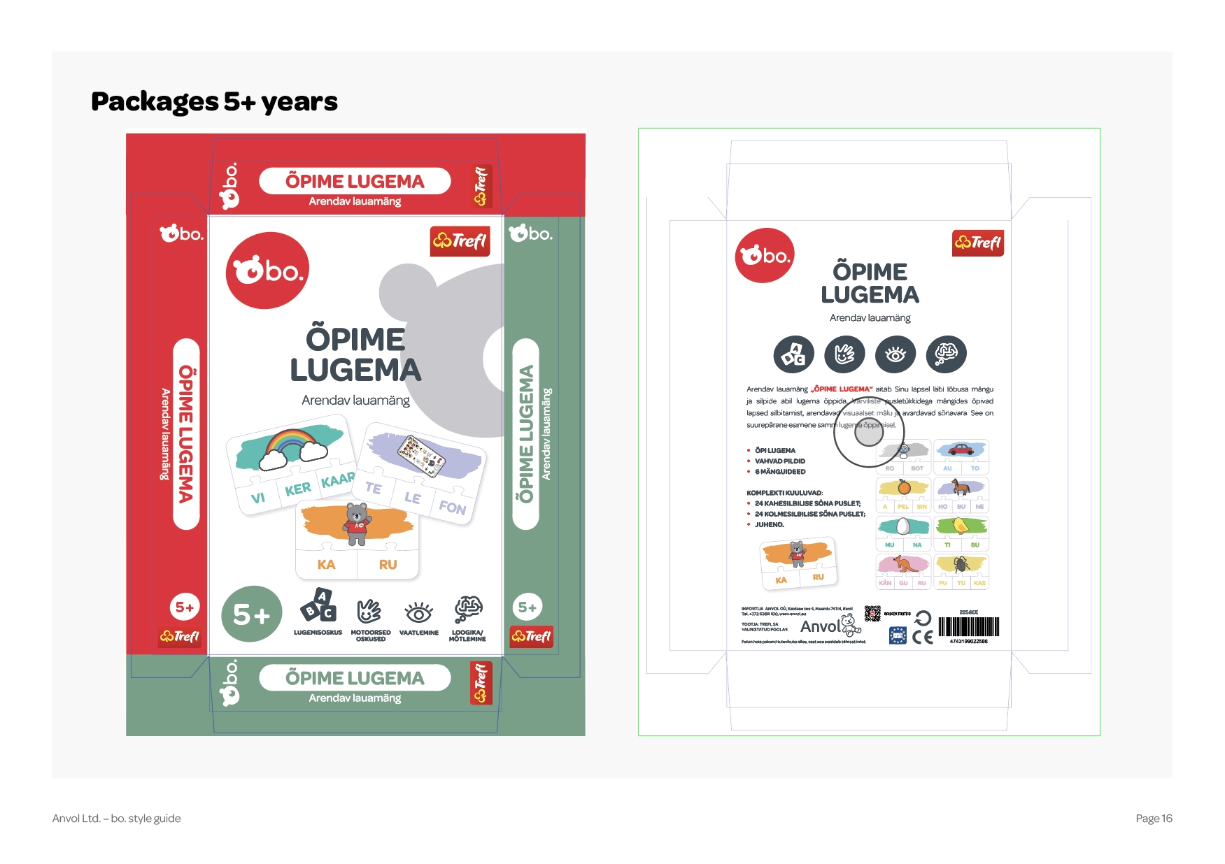


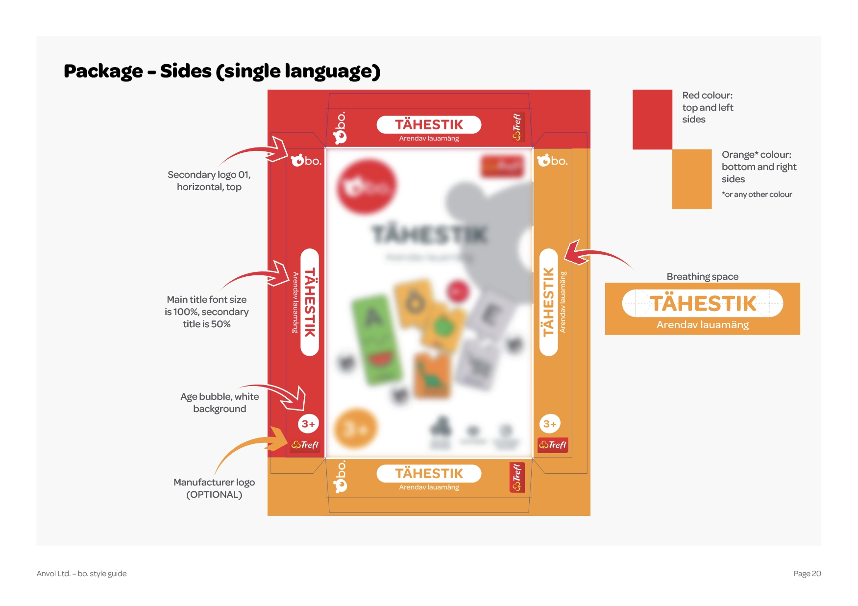


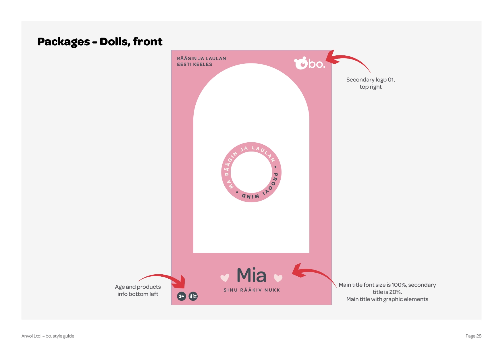


packaging design